Little words, big differences
It’s not a surprising idea that words matter. Anyone who’s ever been to a meeting or presentation about “retro-activating synergistic solutions” knows it. Anyone who’s travelled and had to play charades to order food knows it. And if you still don’t know what covofefe is then you know it too.
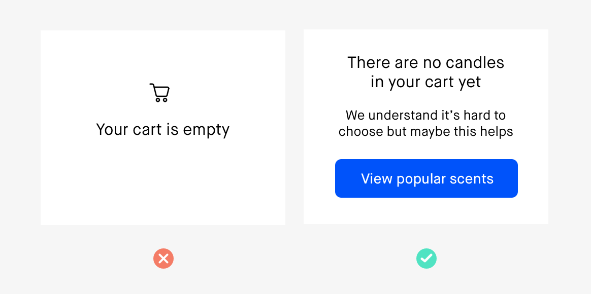
But we rarely obsess over the tiniest pieces of text that help us use digital products and services. This is often called microcopy. It’s the text that appears at crucial moments to help you understand or do something. While it sounds very functional and plain, when done well it should also encompass the voice of your brand. After all, it’s there every time you open an app or buy something online. We just don’t really notice it until it fails or confuses us.
Here are just three ways that the little words you’re overlooking could be having an oversized impact on the way people experience your brand.
Good form
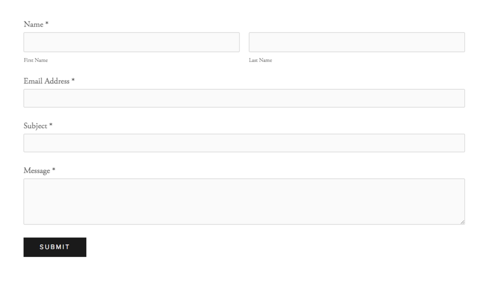
Forms are so standard that we don’t do much thinking when we fill them in. Here’s what you’d typically expect:
- First name
- Last name
- Email address
- A free text box.
But even in these little labels there can be confusion. The idea that your ‘first’ name comes first depends on where you’re from. There are plenty of cultures where your ‘last’ name comes before your ‘first’ name, so Smith John would be the classic example here. You find this order in China, Korea, Japan, Hungary, Romania, Hungary and more.
When you’re speaking to international audiences, the labels ‘first name’ and ‘last name’ might be confusing at best and exclusionary at worst. With China alone making up about 18% of the world’s population it’s important that you’re designing forms that can speak to as many people as possible.
A nice solution is using ‘given name’ and ‘family name’ instead. It’s a good steer from state Registries of Births, Deaths and Marriages here in Australia. And it’s a change that can work with existing forms.
Another thing to consider is that not everyone actually uses their birth name. In Thai culture, for instance, people are given a Westernised nickname from birth, unrelated to any of their given names, and they might never use their ‘official’ name. And plenty of people just prefer their nicknames. Why ask for a name that someone doesn’t respond to? You use names to create closeness, not awkwardness.
Forms can respond to this by offering a single text field labelled ‘Your name’ or ‘Preferred name’. People can choose what they want to be called, whether that involves their family name or not. This might seem pedantic but think about how it feels to be addressed by the wrong name. Even if you’re indifferent, indifference is not a feeling you want a person to feel when they use your product or service.
Push my buttons
Buttons are where the action happens. A button commits someone to the next step, whether it’s reading more or making a purchase. But people are commitment-phobes, even online. And understanding what level of commitment a person has can help convert a window shopper into a customer.
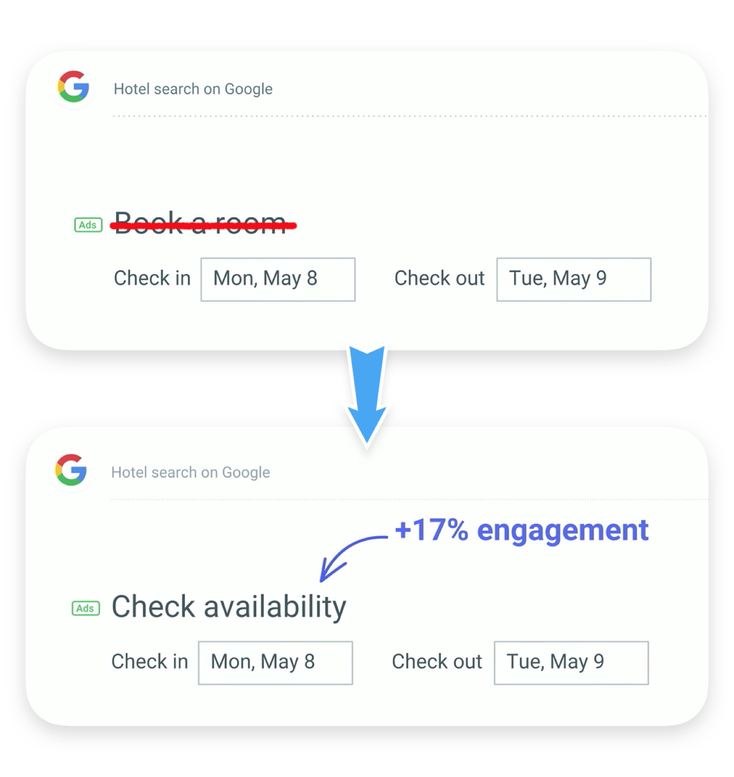
When Google’s accommodation aggregator switched their button from ‘Book now’ to ‘Check availability’ they raised click-throughs by 17%. This small change made it clear that the next step wasn’t about purchasing, but browsing. They met their audience at their level of commitment.
Click triggers
‘Click triggers’ are the words near buttons that can alleviate concerns, or nudge people to click. They can take many different forms, from showing social proof to reassuring people with a refund policy. These are some great examples of how click triggers work:
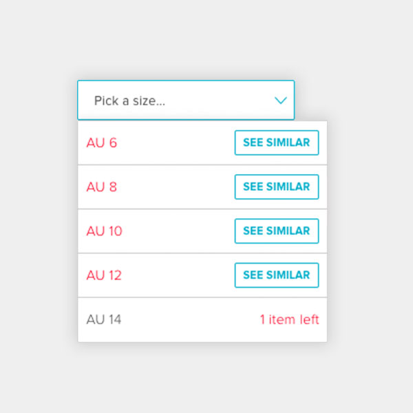
The Iconic lets you know when stock is low. Heightening your sense of scarcity encourages you towards adding an item to your bag. This isn’t a brazen attempt to sell though, it’s really useful to know that something you have your eye on might not be there in an hour.
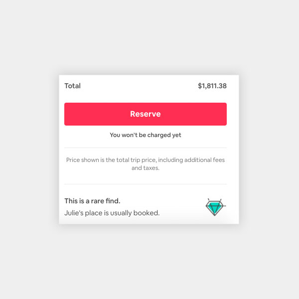
Airbnb removes the concern that you’ll be charged well in advance of your stay, something that can be inconvenient when planning a holiday well in advance; it makes it a little easier to hit ‘reserve’. It also lets you know that a place is popular — it’s reassuring to know that others have stayed there but it also increases that familiar feeling of scarcity.
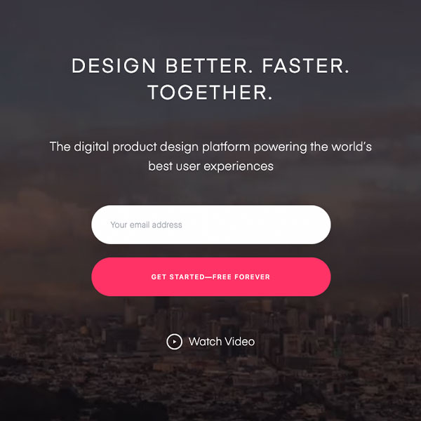
InVision reminds you that you never have to pay for their product, lowering a major barrier to trying any new software: the eventual cost to you. Right at the moment you press this button you’re forced to think, “What do I have to lose?”
These are just a few examples from the universe of microcopy. You might not think about these flourishes but they drive your behaviour in digital spaces.
Ultimately, words can be a small amount of real estate on a page, but they can have a profound impact on the way your brand works and feels. The next time you’re creating a digital experience, give some thought to how hard your words have to work when they live in smaller spaces. You can have a beautiful design and seamless user flows, but what’s the point if your words get in the way?