- Copywriting
- Strategy
- Branding
- Video
- Animation
- UX/UI
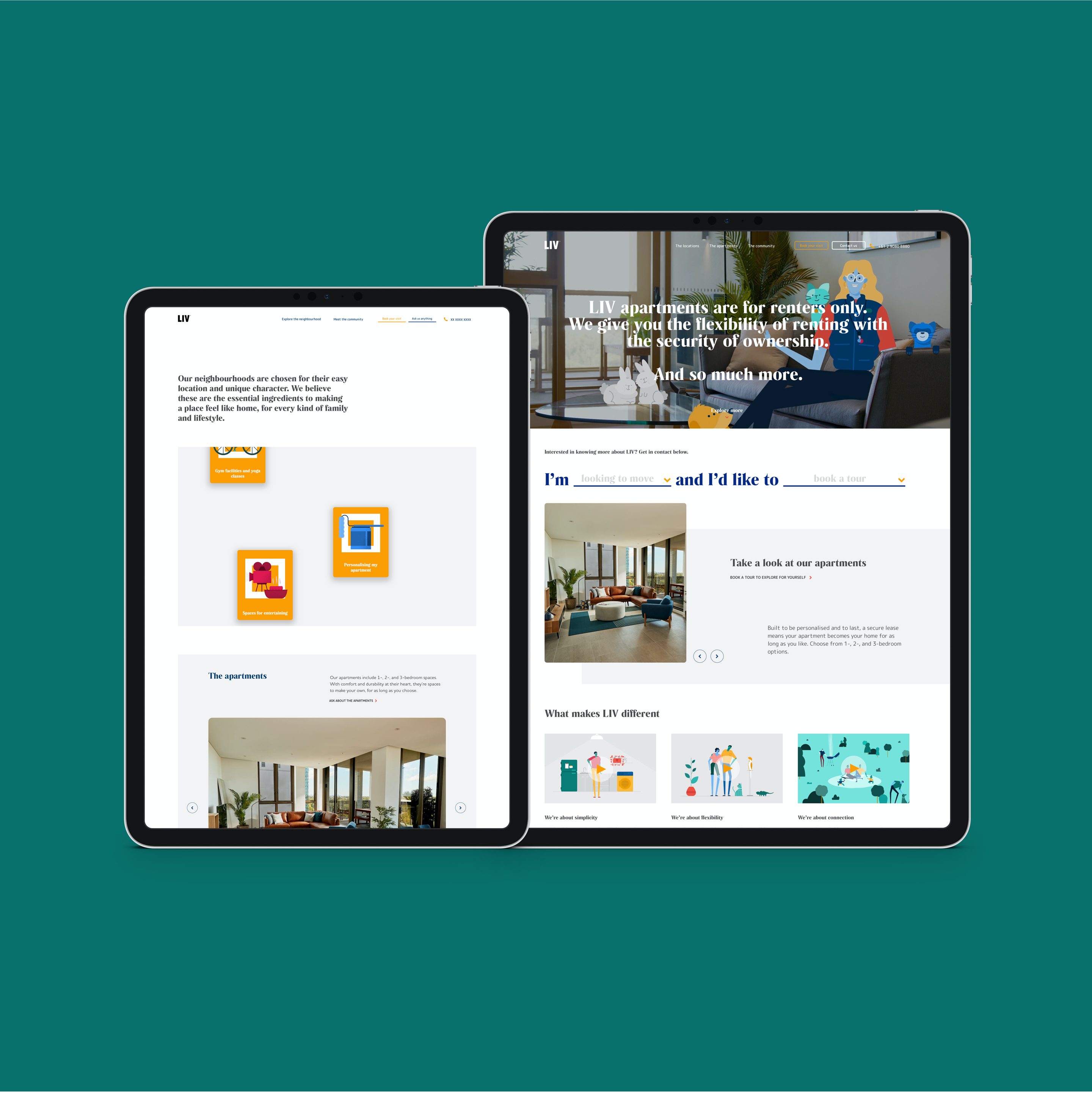
- Website
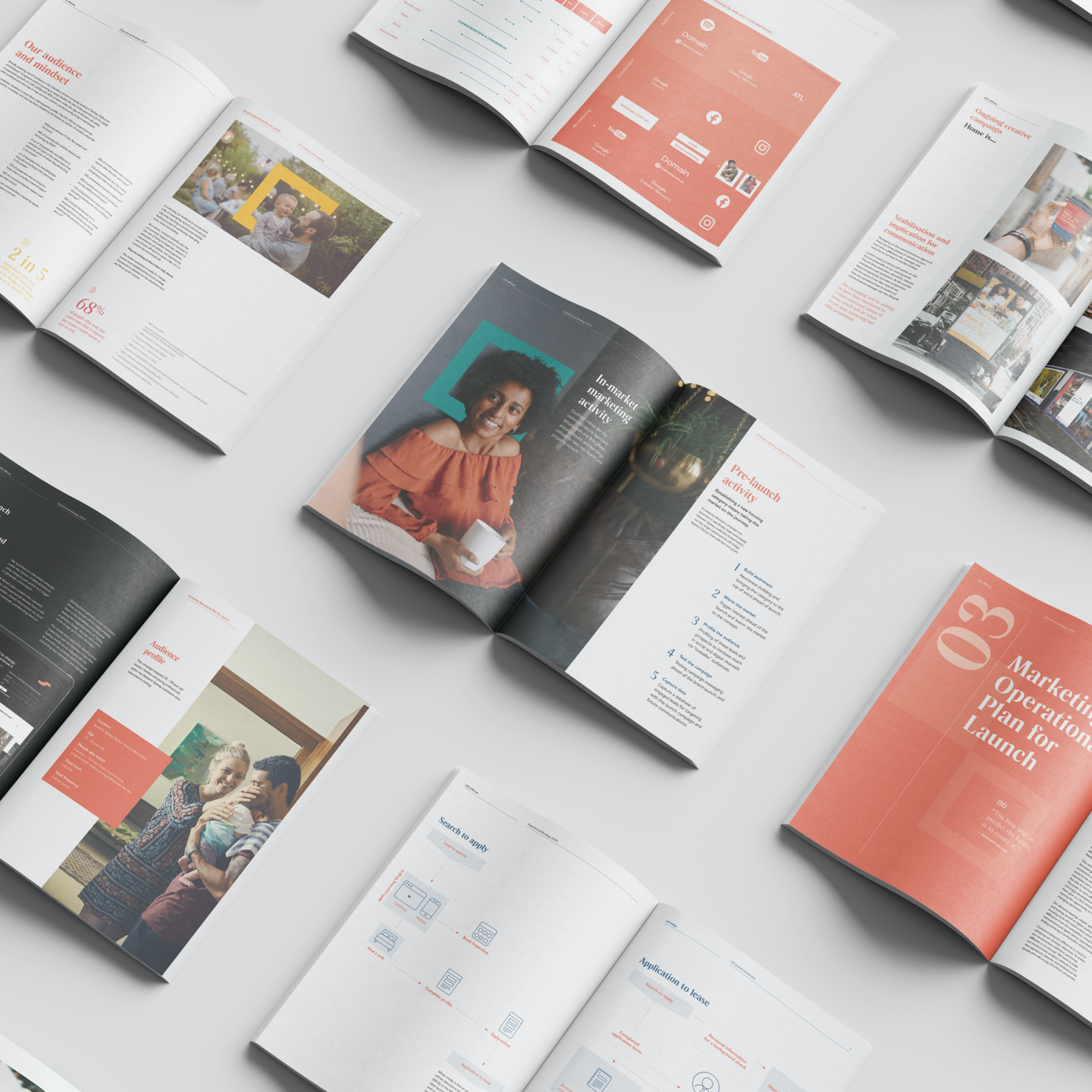
Launching a brand, product and a new category of housing all in one
For many Australians, the homeownership dream is more of a mirage. It’s becoming more and more unattainable and unrealistic. But the alternative, the rental market, has always treated people as second-class citizens. In response, Mirvac (a leading Australian property developer) looked to launch Australia’s first large-scale, built-to-rent offering. LIV offered the security of ownership with the flexibility of renting: a third housing option.
Our challenge was to develop and launch a creative strategy and brand expression that conveyed a totally different living experience. It needed to be uplifting but practical, suited to future projects — and able to launch the first property of its kind, LIV Indigo at the same time.
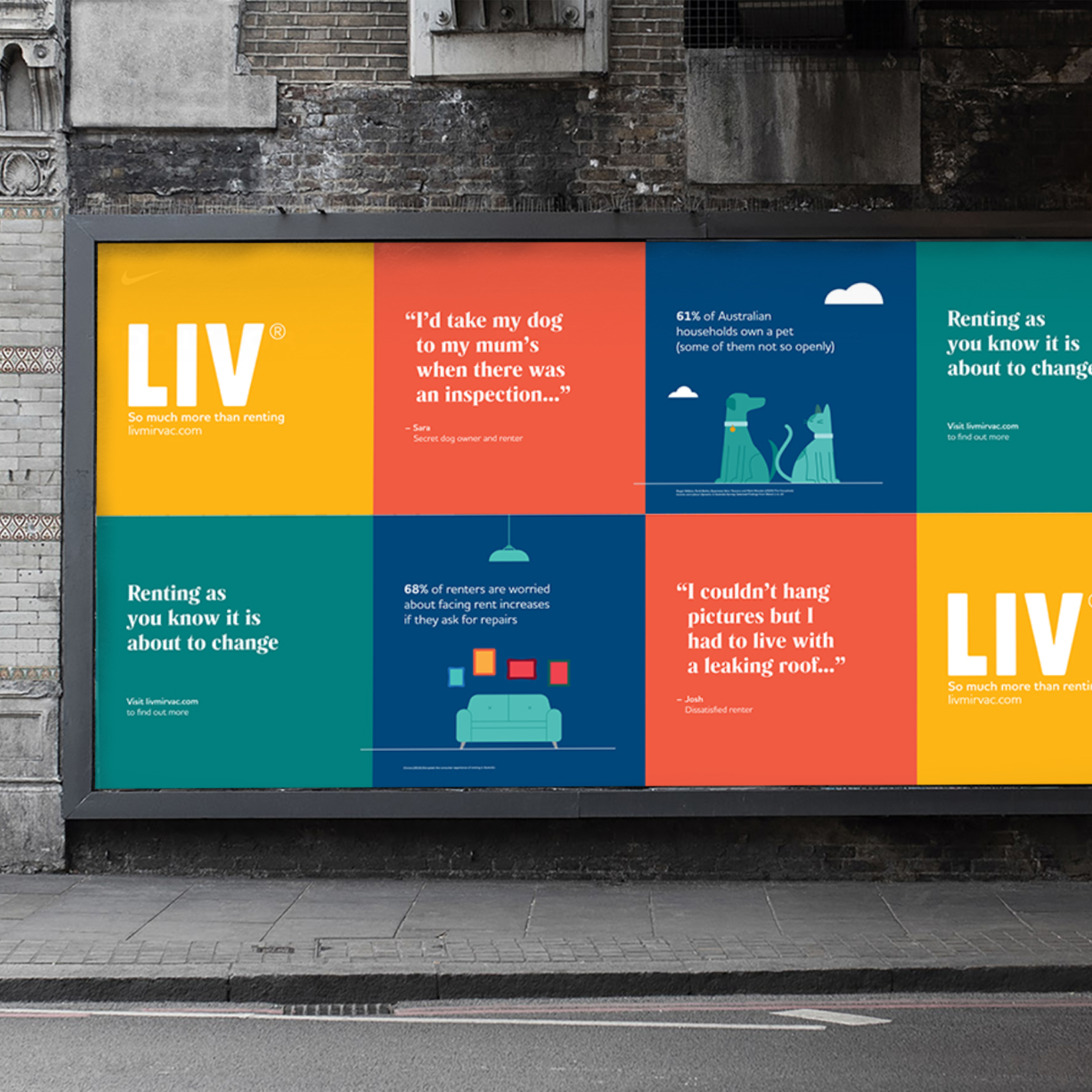
A shift of power
LIV is designed and built only for renters. With amenities, community events, eco-conscious design, secure leases and apartments renters can personalise, it combines the best of both owning and renting.
Working with global insights agency Kantar Consulting, we developed a creative strategy that shifted power from landlords and property agents to renters. The value proposition, ‘A way to live built around you’, responded to the enduring human needs of safety, individuality and community.
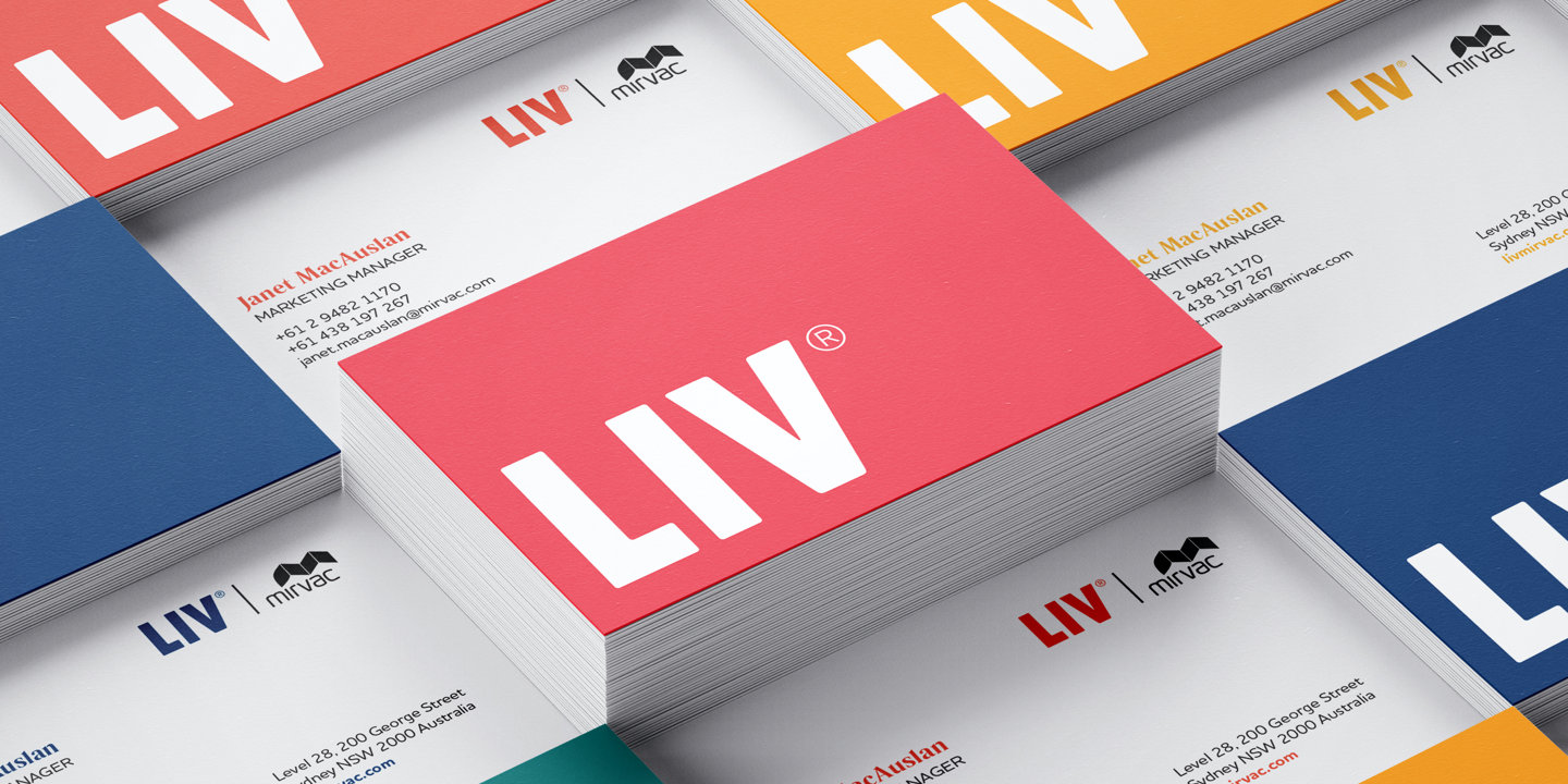
Typefaces, colour palettes, graphics and brand voice were led by principles of clarity, adaptability and approachability. The result bends to fit any space while remaining distinctive in a sea of landlords and real estate agents.


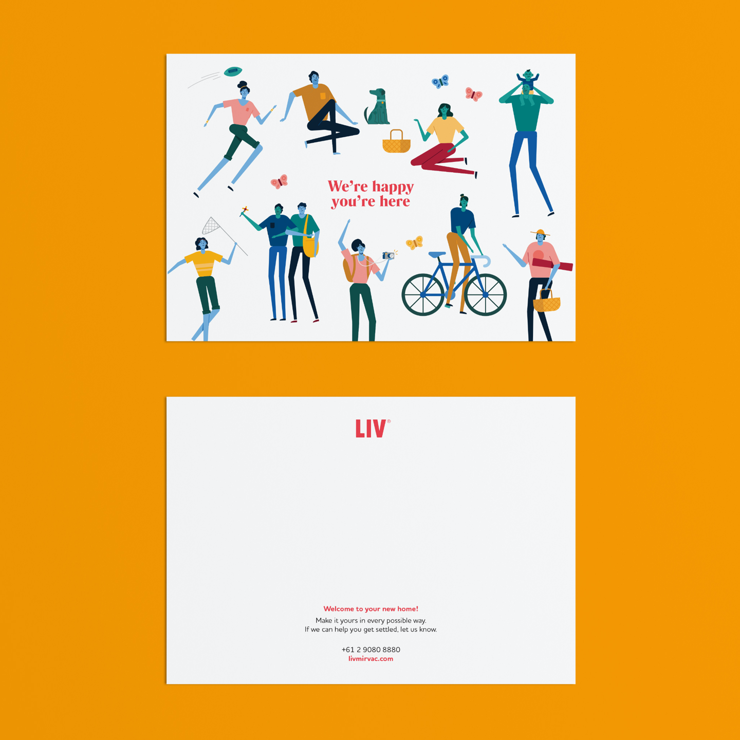
A focus on people
LIV’s brand identity responds to the complexity and constraints of the housing market with simple and flexible elements. The branding adapts to live digitally, in print and on-site through a mix of mediums.
A simple, square graphic frames residents in the context of their lives. Typefaces are friendly but idiosyncratic, while LIV’s colour palette and voice embody the practical optimism of the brand.
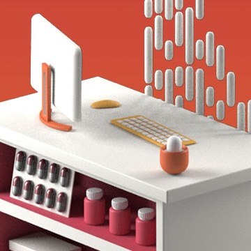
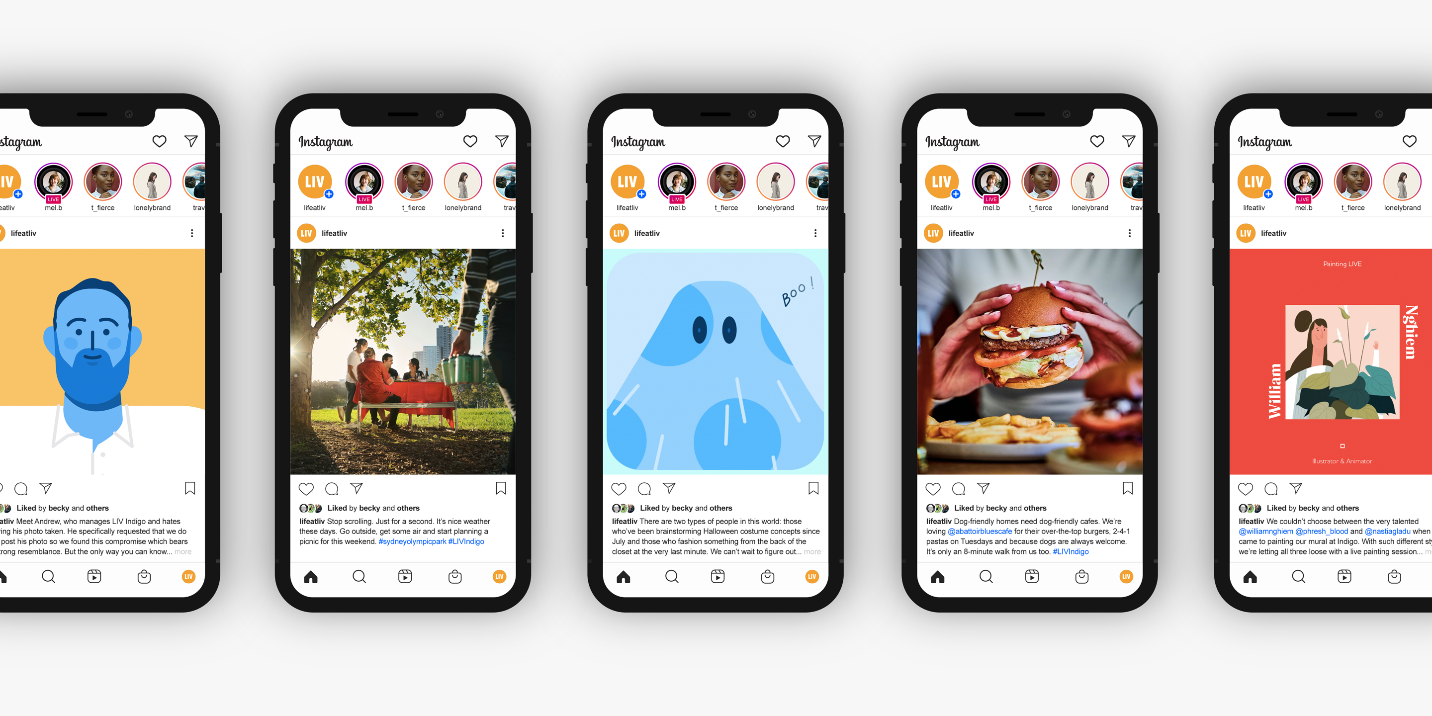
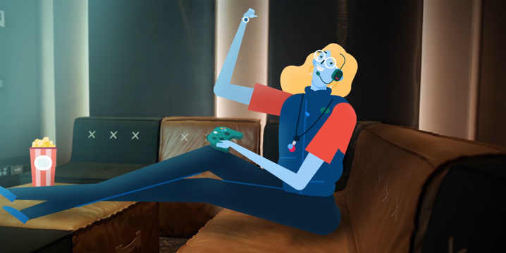
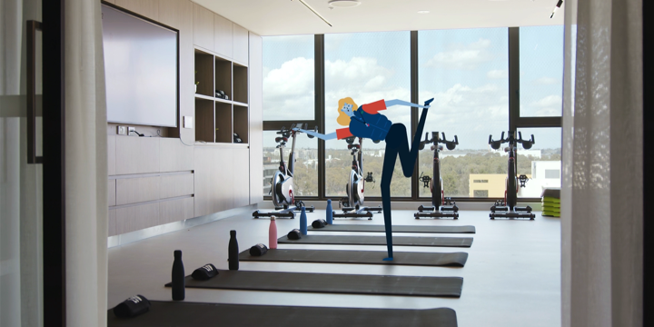
A bespoke illustration style was developed for animation, video, digital channels and print assets. It evokes playfulness in a relatively uniform industry while varying colourways can suit different moods and purposes.

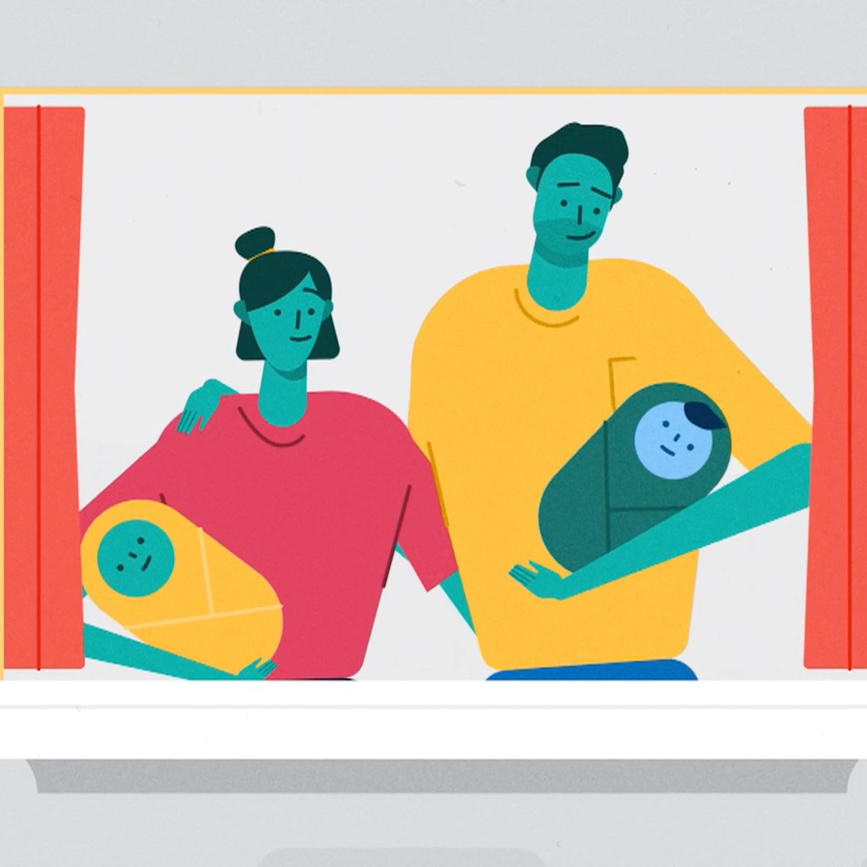
Creating an animated world
We relied on an animated explainer to bring the LIV platform to life. The flagship building was still under construction. Yes, we were working with a product that didn’t quite exist yet.
Rather than relying on uncanny real estate renders to ‘sell the product, we wanted to appeal to people with benefits that couldn’t be found in a typical rental. Animation offered an efficient, imaginative way to summarise a whole new way of living without needing to rely on real estate cliches.
After developing hundreds of illustrated assets for the animation, we appropriated these assets for the LIV website, social content and across print and digital.


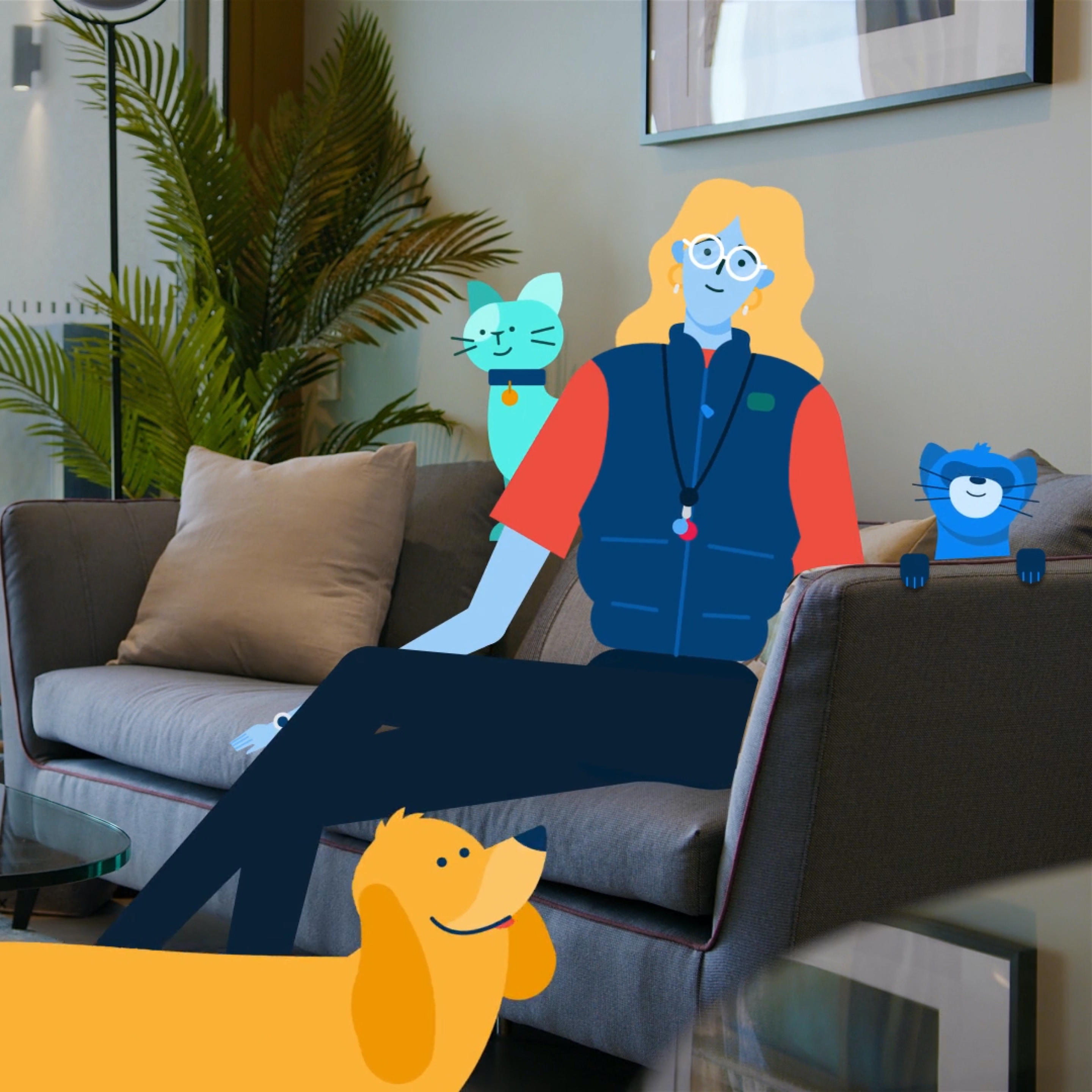
People… not ‘end users’
Complemented by the brand tone of voice, we created a visual feast by combining animation with live-action video, to feature the LIV Indigo apartments and amenities. The video highlights the resident-centric experience, introduces viewers to the LIV community, and shows how LIV bucks the forced choice between renting and owning, offering ‘a third way’ to live.
Like what you see?
- Copywriting
- Strategy
- Branding
- Video
- Animation
- UX/UI
- Website
Lorem ipsum
dolor sit amet
Lorem ipsum dolor sit amet, consectetur adipisicing elit. Qui aperiam dignissimos omnis. Ipsa quo similique aut consectetur voluptate odit, voluptatem, facilis! Tempora omnis ad nesciunt laborum ut numquam porro ratione!
Lorem ipsum dolor sit amet, consectetur adipisicing elit. Rem, laborum repellat nesciunt magnam numquam. Ex consequatur voluptas quidem nam recusandae ab ullam, incidunt ea voluptatum delectus voluptatem, quisquam quas, quae.
Lorem ipsum dolor sit amet, consectetur adipisicing elit. Reprehenderit dolore molestiae corrupti ullam molestias quas nostrum id nobis architecto obcaecati magni debitis nulla accusantium perferendis, necessitatibus at! Animi, alias, consectetur?

Qui aperiam dignissimos omnis

Lorem ipsum dolor sit amet, consectetur adipisicing elit
Lorem ipsum dolor sit amet, consectetur adipisicing elit. Rem, laborum repellat nesciunt magnam numquam. Ex consequatur voluptas quidem nam recusandae ab ullam, incidunt ea voluptatum delectus voluptatem, quisquam quas, quae.
Lorem ipsum dolor sit amet, consectetur adipisicing elit. Reprehenderit dolore molestiae corrupti ullam molestias quas nostrum id nobis architecto obcaecati magni debitis nulla accusantium perferendis, necessitatibus at! Animi, alias, consectetur?

Tempora omnis ad nesciunt