- Copywriting
- Strategy
- Branding
- Design
A changing landscape
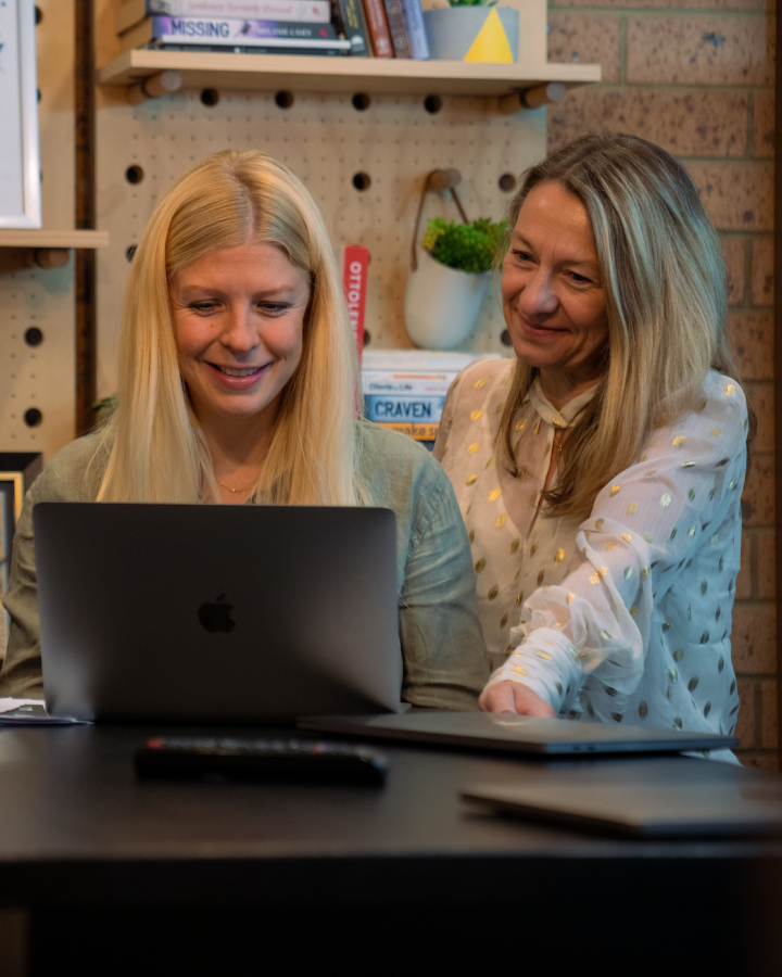
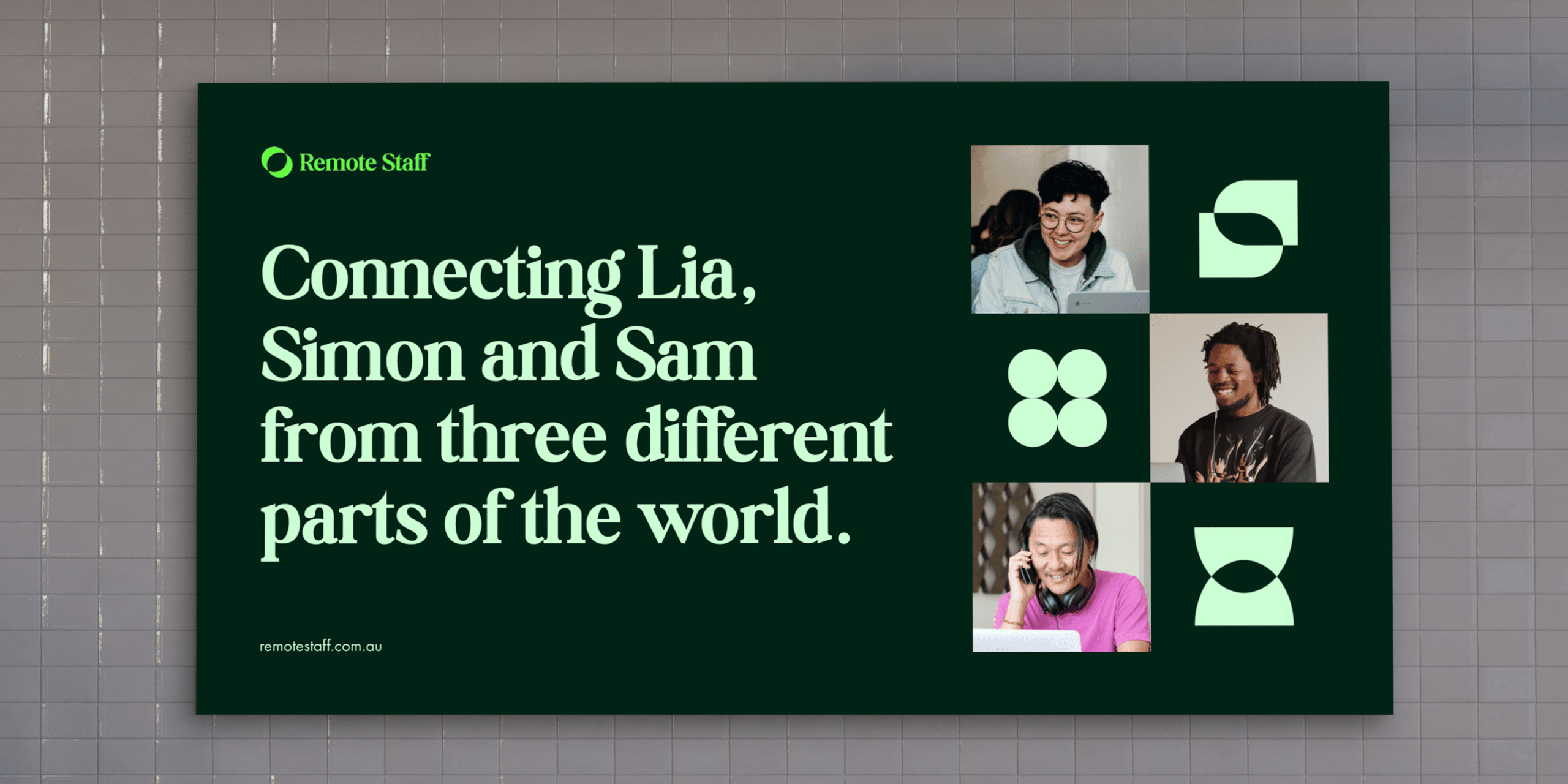
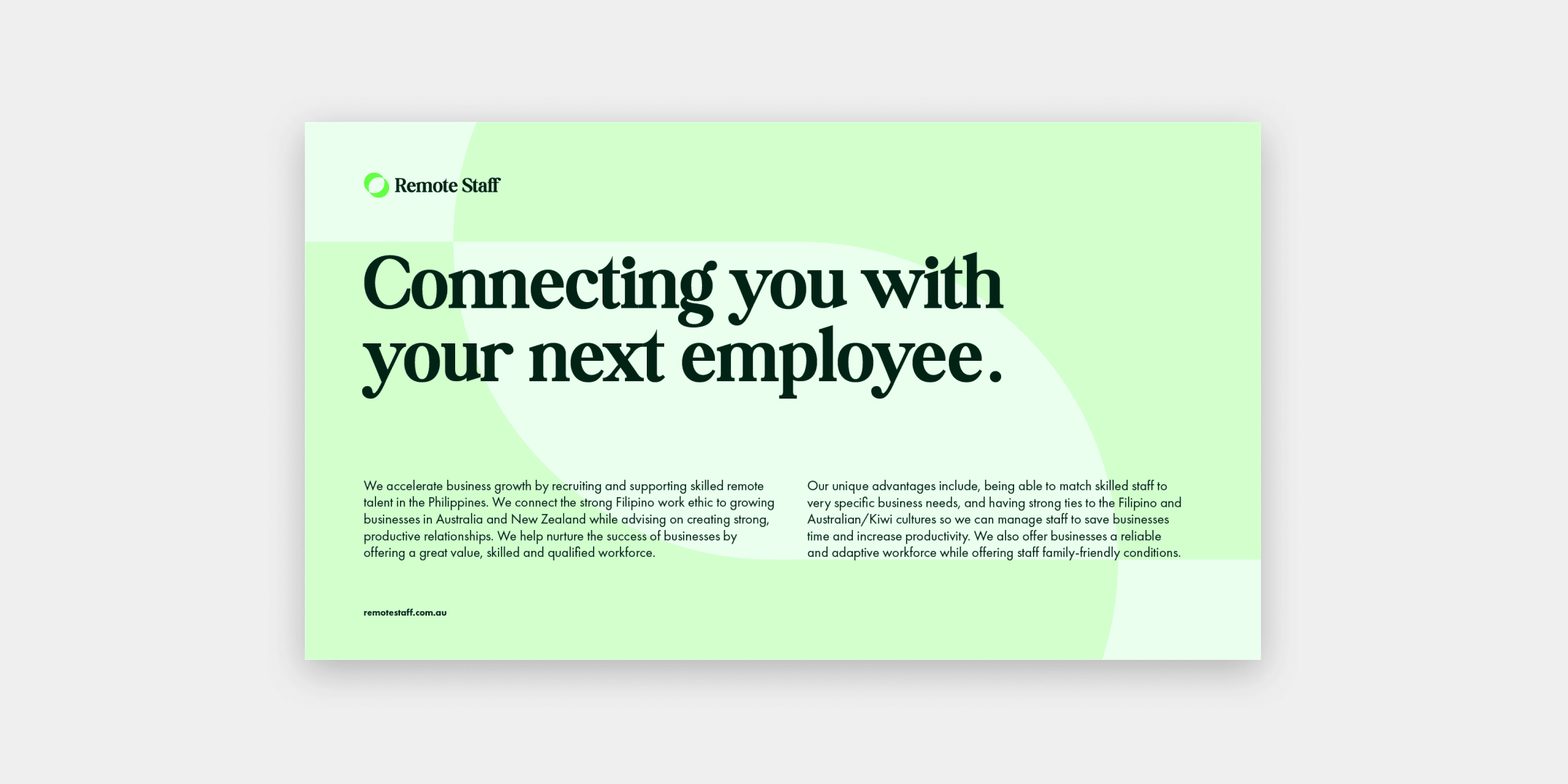
Remote Staff is a remote recruitment platform, helping entrepreneurs and small businesses grow faster by connecting them with skilled remote talent from the Philippines.
When Remote Staff was launched in the Philippines, there were only nine competitors in the market. Since then, the market has grown significantly and is now saturated, with many others competing for the same talent pool and for the same clients.
The brand needed to evolve on two fronts. Firstly, retain and continue to grow their talent pool of contractors, and secondly, better articulate the value they bring as a brand to their clients, beyond just the sourcing phase of recruitment.


Owning the name of the game
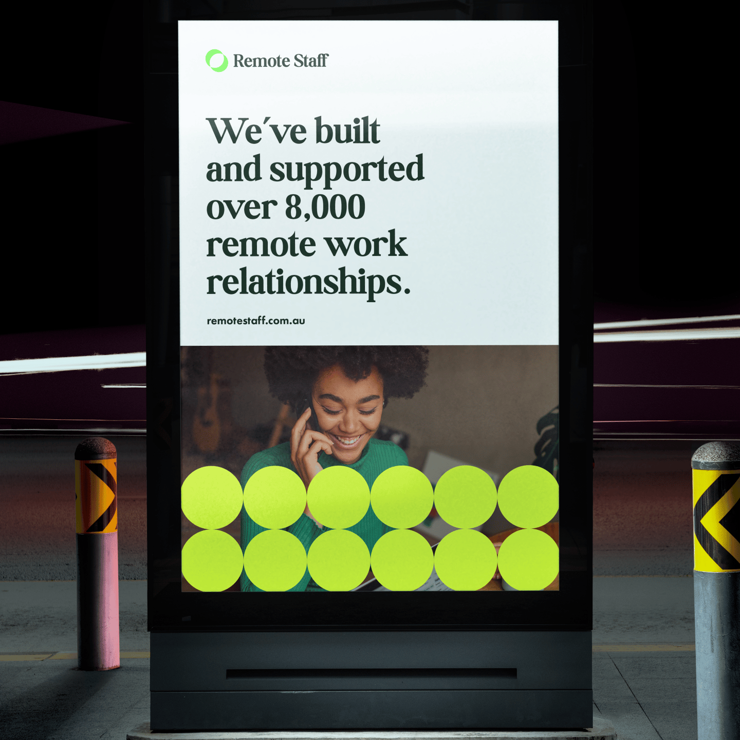
The Remote Staff name was a clear benefit, helping them to own the space and pointing to their longevity, however this alone wasn’t going to keep them at the top in an ever-changing landscape.
We conducted a rigorous investigation into all sides of their business, including interviews with all parties to get to the heart of what makes Remote Staff tick.
We established that, as that remote work was no longer a key point of difference post-pandemic, the brand needed to better articulate the ongoing support they provide to both contractors and clients. This message needed to be clearly connected to the overall concept of growth.
The opportunity for Remote Staff to build deeper relationships with small businesses by supporting them beyond just the introduction in that critical moment of recruitment. Because the first hire for a new role is the hardest. And that is where Remote Staff can add value as a long-term partner.


Piecing together the new brand
Our solution was to convey the idea of Remote Staff as the ‘missing piece’ that small businesses need to continue growing.
This started with the new logomark, stemming from the idea that Remote Staff bring two worlds together by seamlessly merging the right client with the right contractor, working with circles that reflect two worlds and two parties. When layered on top of each other, the circles create an interesting intersection in the middle – reflective of the connection Remote Staff represent.
Framing the proposition
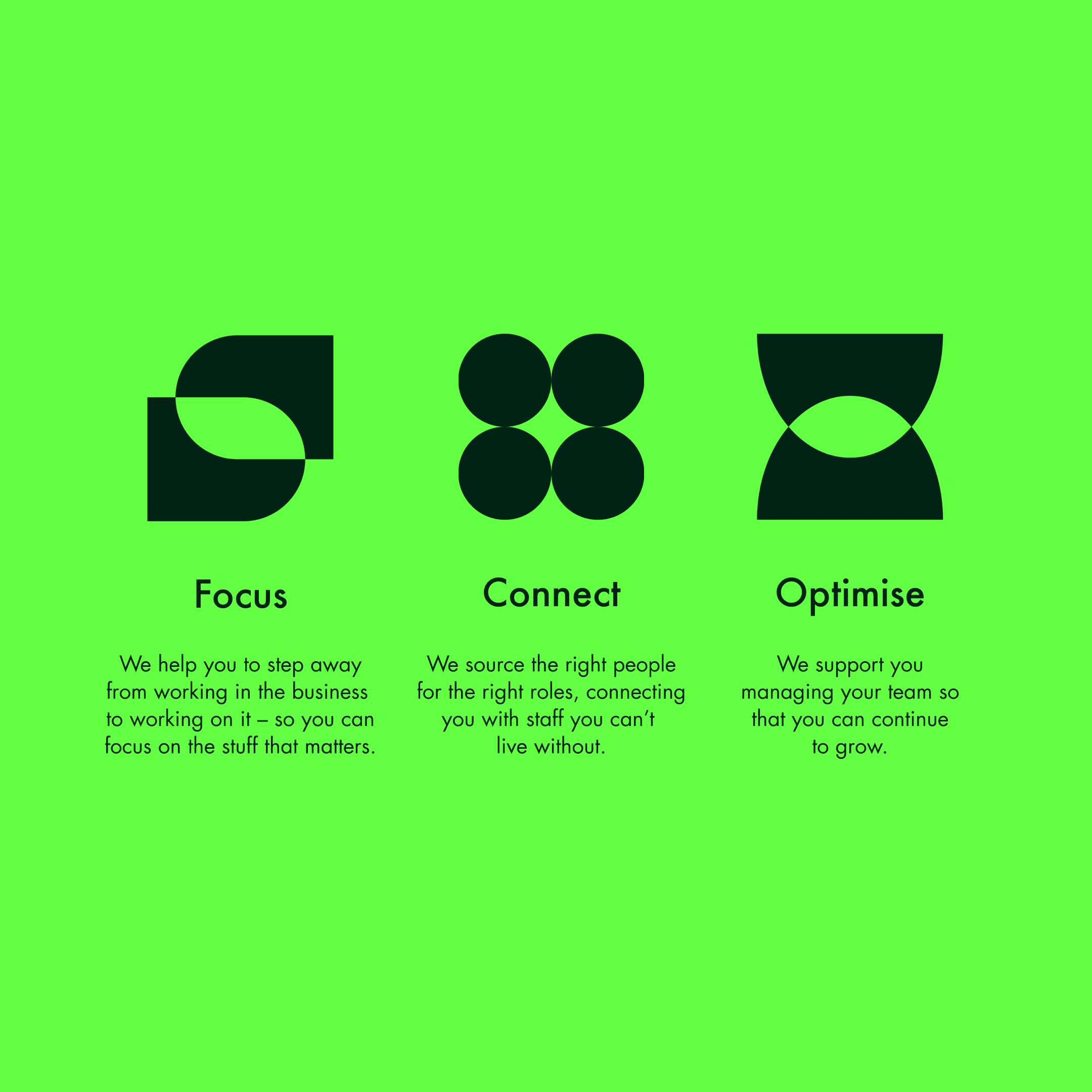
As well as our logomark, three further core shapes complete the visual system. Each shape taking on the meaning of a key value proposition of focus, connect and optimise.
Focus: inspired by the act of taking a closer look, the way a microscope is used, and blocking out surrounding elements so we can focus on one thing.
Connect: reflecting the people of Remote Staff that connect and work together.
Optimise: taking on the form of an eye, this value is about support. So we formed it with two elements, with the bottom shape representing Remote Staff’s support of the top shape, which is the client and their team.
These shapes also scale easily to include copy within the intersections that we want to highlight, alternatively their opacity can be lowered to sit behind copy to brand heavier pieces of content. Overall, like the logomark – the shapes are combined to create these intriguing intersections.


A category leader that stands out
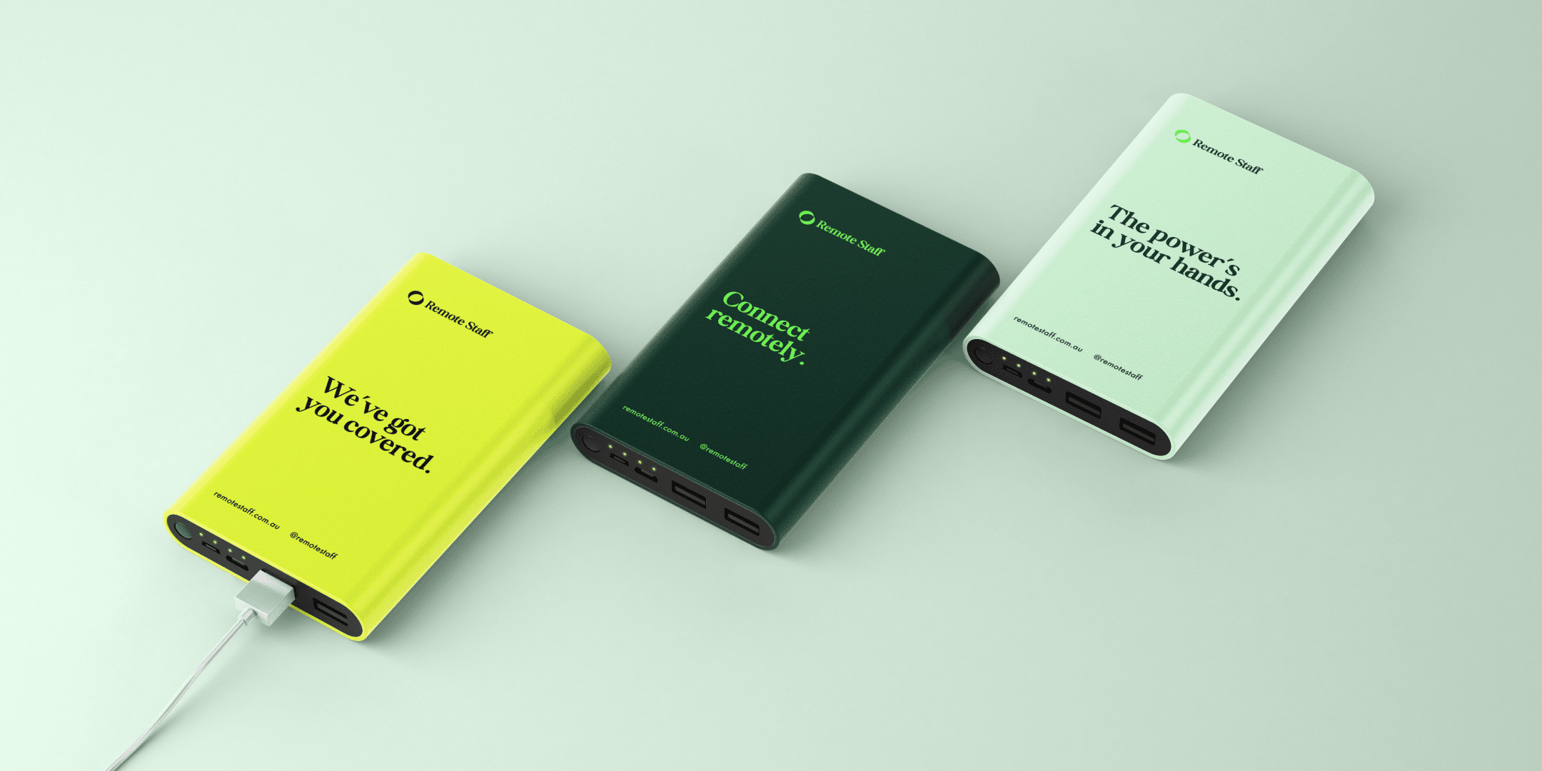
The new Remote Staff brand is distinct in its category, this is supported by the new colour palette, exploring the combination of dark and vibrant tones – colour space that none of their competitors sit in and compliments the digital space it sits within.
Every element of the new brand has a meaningful connection to the brand’s key attributes and value propositions, helping Remote staff meaningfully paint a clearer picture of their role for both the talent they recruit and the clients they serve.
Like what you see?
- Copywriting
- Strategy
- Branding
- Design
Lorem ipsum dolor sit amet
Lorem ipsum dolor sit amet, consectetur adipisicing elit. Qui aperiam dignissimos omnis. Ipsa quo similique aut consectetur voluptate odit, voluptatem, facilis! Tempora omnis ad nesciunt laborum ut numquam porro ratione! Lorem ipsum dolor sit amet, consectetur adipisicing elit. Rem, laborum repellat nesciunt magnam numquam. Ex consequatur voluptas quidem nam recusandae ab ullam, incidunt ea voluptatum delectus voluptatem, quisquam quas, quae. Lorem ipsum dolor sit amet, consectetur adipisicing elit. Reprehenderit dolore molestiae corrupti ullam molestias quas nostrum id nobis architecto obcaecati magni debitis nulla accusantium perferendis, necessitatibus at! Animi, alias, consectetur?

Qui aperiam dignissimos omnis


Lorem ipsum dolor sit amet, consectetur adipisicing elit
Lorem ipsum dolor sit amet, consectetur adipisicing elit. Rem, laborum repellat nesciunt magnam numquam. Ex consequatur voluptas quidem nam recusandae ab ullam, incidunt ea voluptatum delectus voluptatem, quisquam quas, quae.
Lorem ipsum dolor sit amet, consectetur adipisicing elit. Reprehenderit dolore molestiae corrupti ullam molestias quas nostrum id nobis architecto obcaecati magni debitis nulla accusantium perferendis, necessitatibus at! Animi, alias, consectetur?

Tempora omnis ad nesciunt