- Naming
- Strategy
- Branding
Codename: Project Wilbur
Avista Strategy came to us as a group of consultants from across the industry that were covertly collaborating on a new challenger offering for the category; working under the codename Project Wilbur. They invited us to help create their new brand from scratch, uniting the group’s shared spirit under one masthead.
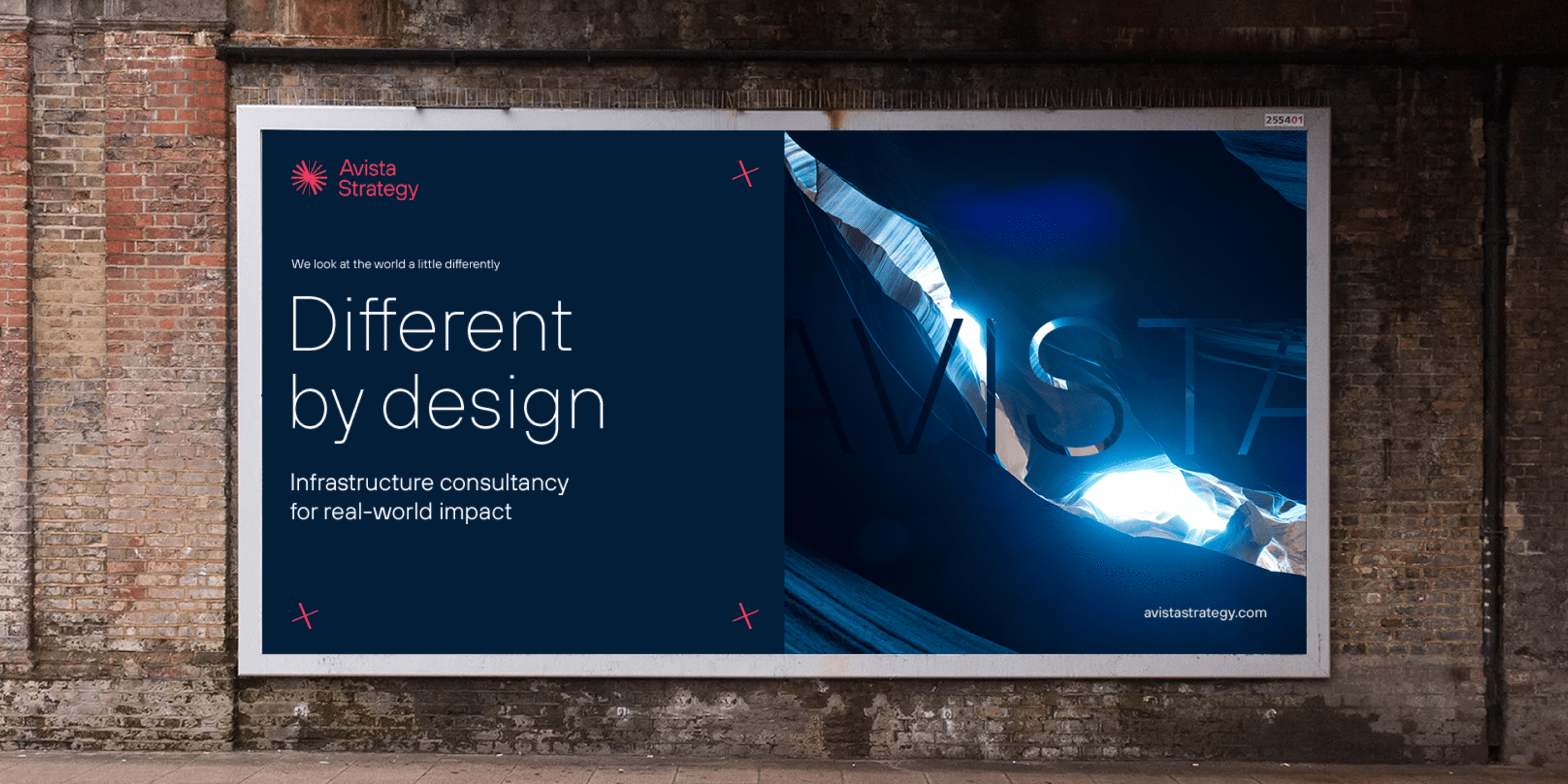
Different by design
After extensive research, category analysis and interviews with each Project Wilbur member, the strategy defined that we needed to become a consultancy that’s more modern in its construction, and more diverse in its make up than the rest; enabling them to solve problems of the future, for people and communities. This led to a simple yet powerful proposition, different by design.

Stepping out from the shadows
As much as we loved working under a codename, it was time to find the group their public facing name. One that speaks to the spirit of the group, provides a feeling of motion, and a sense of transformation.
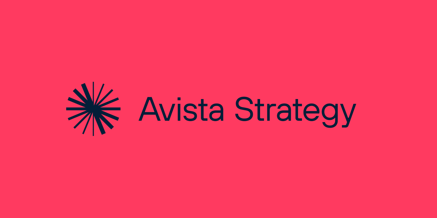
The team settled on Avista, formed from ‘Aristotle’, the great thinker and ‘Vedere’ — latin ‘to see’ or ‘to grasp an idea’. This word gave us our sense of agility and energy balanced by controlling a’s at either end. ‘Strategy’ was chosen as the descriptor, with the potential to drop away as the brand builds recognition.
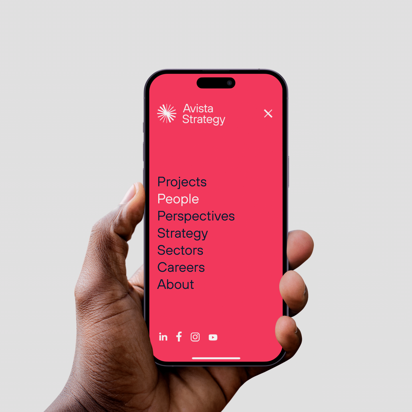
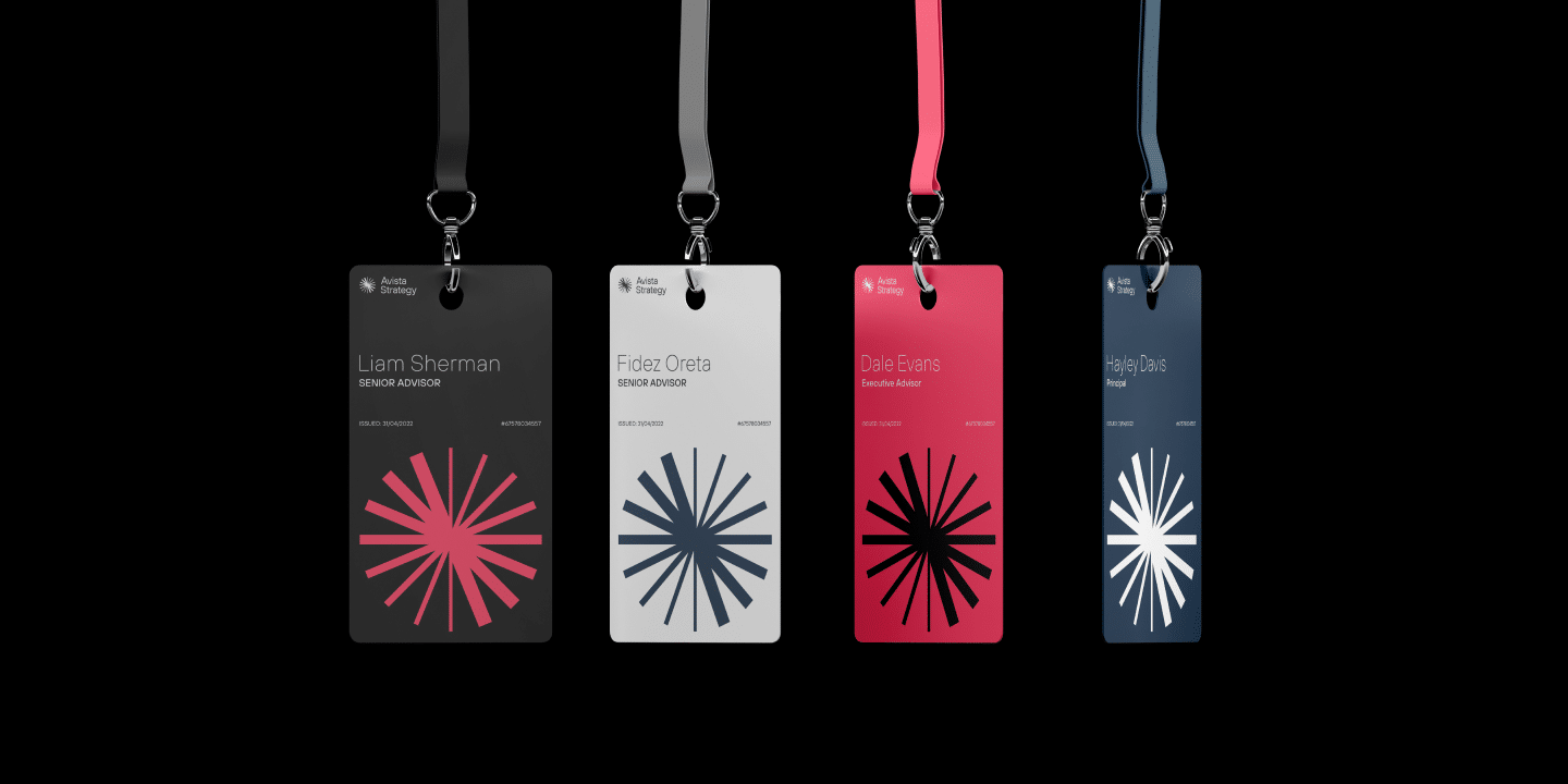
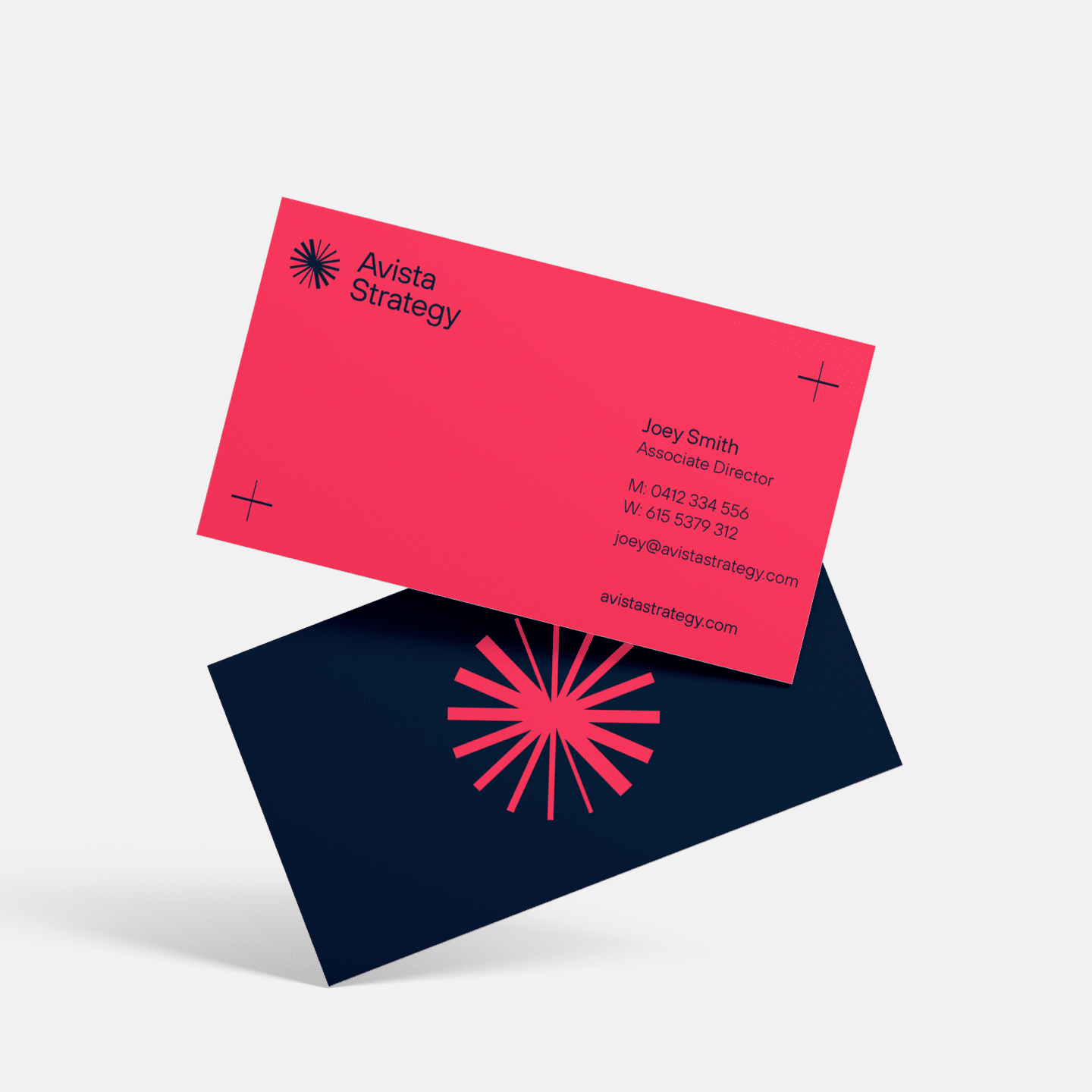
The Avista Asterisk
The logomark, inspired by the name, carries on the sense of motion. We focused on revolutionary ideas and the team that supports each other with diverse perspectives, an inherent belief in the power of the collective.
Comprised of 8 ‘spokes’, all at varying stroke weights, the mark not only speaks to the diverse nature of the Avista team, but the idea of best practice — learning from previous projects to improve on the next.
Crosshairs are lifted from the asterisk. Each slightly varied from the next, symbolising the different backgrounds of each team within Avista. The ‘framing’ created with the placements of the crosshairs pays homage to their industry—infrastructure consultancy—inspired by blueprints.
A new kind of consultancy
The brand new Avista has a carefully poised identity. Recognisable as an ambitious new player in its category, but equally distinct with its own edge.
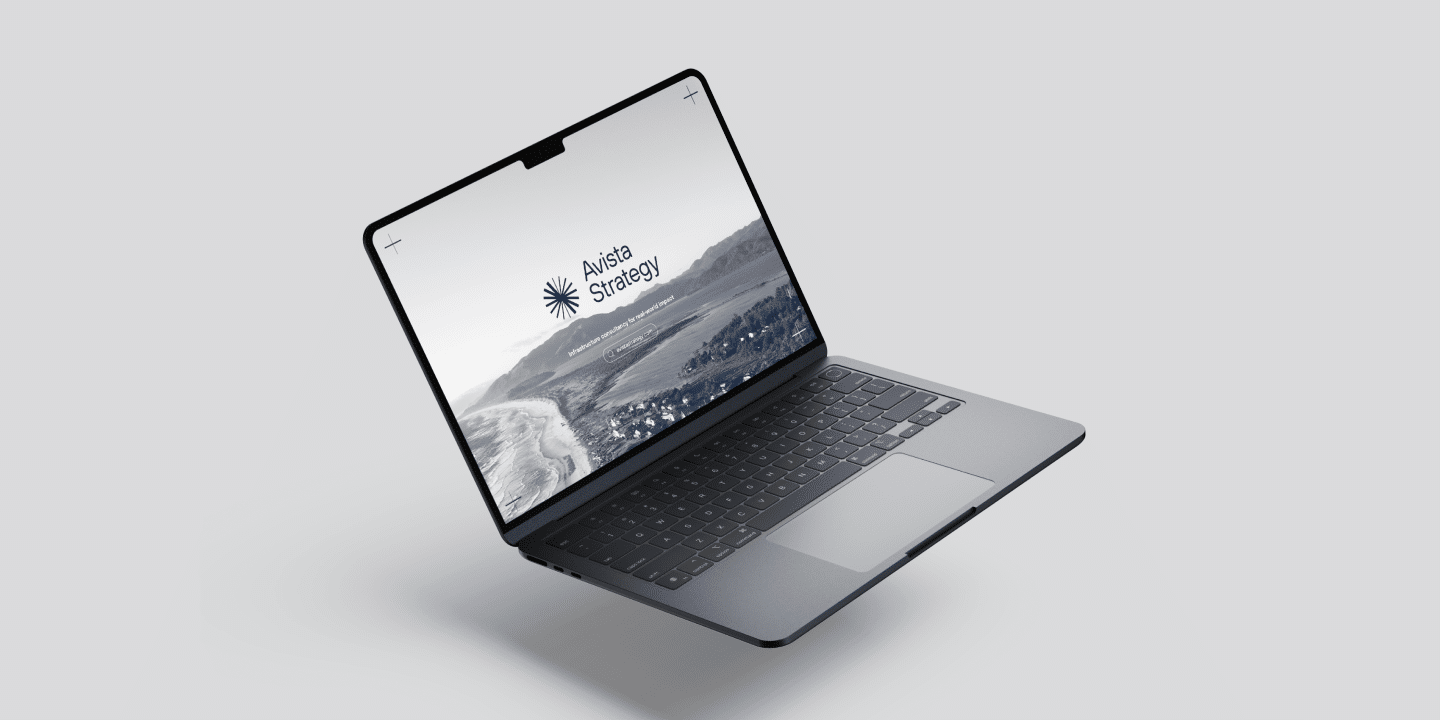
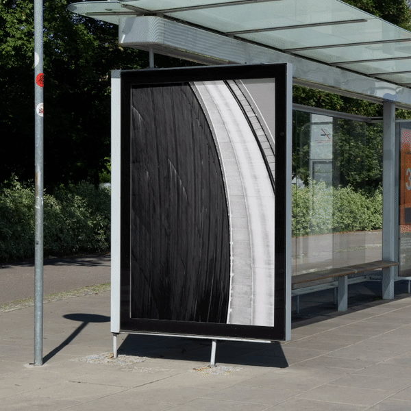
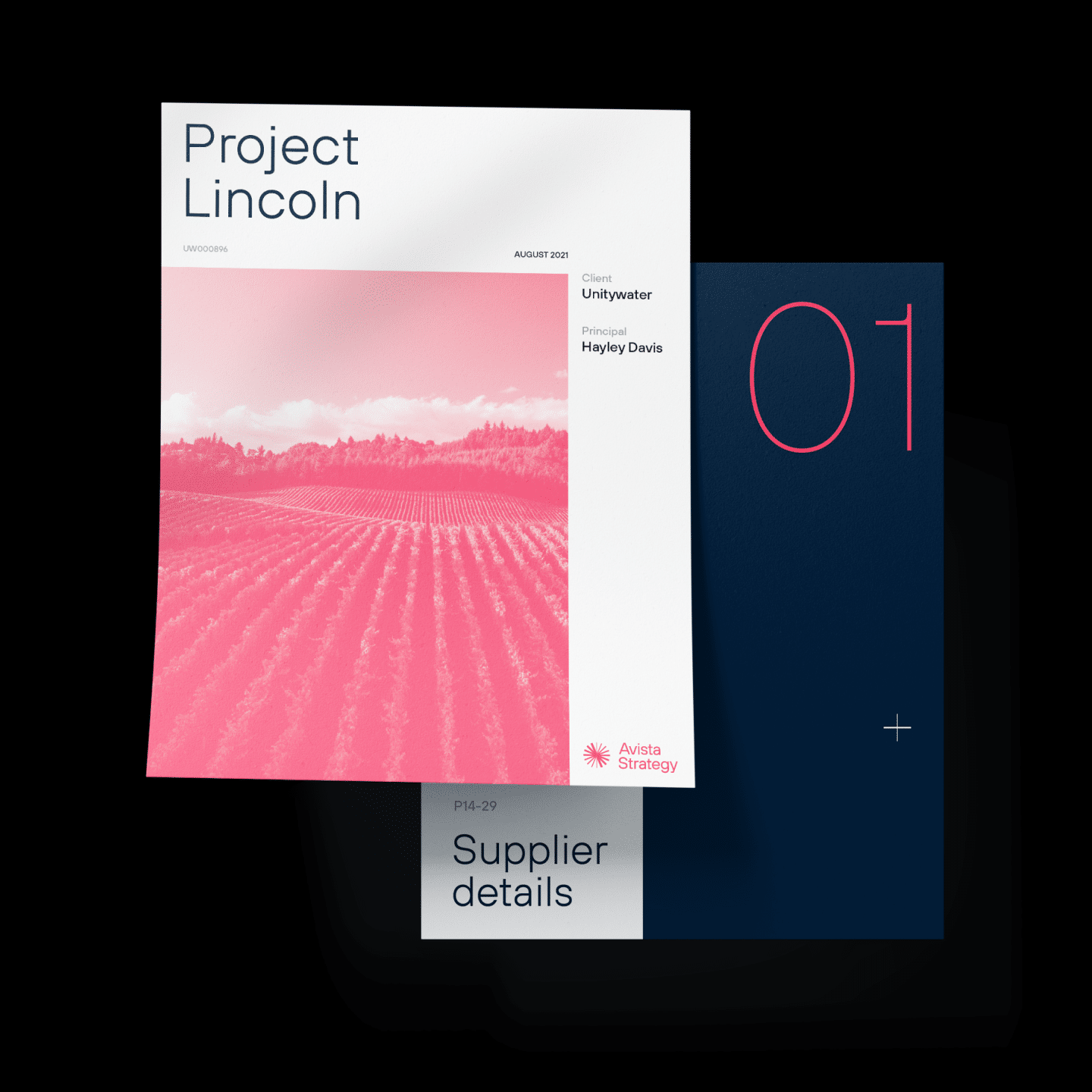
Each element in its construction speaks to this. Imagery that always puts the client first. Angular typography that offers a nod to infrastructure, while remaining open and friendly. A colour palette that delivers strength and conviction, with a touch of unexpected brightness. Every piece tells the story of a brand that’s going to change the industry from the inside.
Like what you see?
- Naming
- Strategy
- Branding
Lorem ipsum
dolor sit amet
Lorem ipsum dolor sit amet, consectetur adipisicing elit. Qui aperiam dignissimos omnis. Ipsa quo similique aut consectetur voluptate odit, voluptatem, facilis! Tempora omnis ad nesciunt laborum ut numquam porro ratione!
Lorem ipsum dolor sit amet, consectetur adipisicing elit. Rem, laborum repellat nesciunt magnam numquam. Ex consequatur voluptas quidem nam recusandae ab ullam, incidunt ea voluptatum delectus voluptatem, quisquam quas, quae.
Lorem ipsum dolor sit amet, consectetur adipisicing elit. Reprehenderit dolore molestiae corrupti ullam molestias quas nostrum id nobis architecto obcaecati magni debitis nulla accusantium perferendis, necessitatibus at! Animi, alias, consectetur?

Qui aperiam dignissimos omnis


Lorem ipsum dolor sit amet, consectetur adipisicing elit
Lorem ipsum dolor sit amet, consectetur adipisicing elit. Rem, laborum repellat nesciunt magnam numquam. Ex consequatur voluptas quidem nam recusandae ab ullam, incidunt ea voluptatum delectus voluptatem, quisquam quas, quae.
Lorem ipsum dolor sit amet, consectetur adipisicing elit. Reprehenderit dolore molestiae corrupti ullam molestias quas nostrum id nobis architecto obcaecati magni debitis nulla accusantium perferendis, necessitatibus at! Animi, alias, consectetur?

Tempora omnis ad nesciunt