- Production
- Branding
- Animation
- UX/UI
- Design
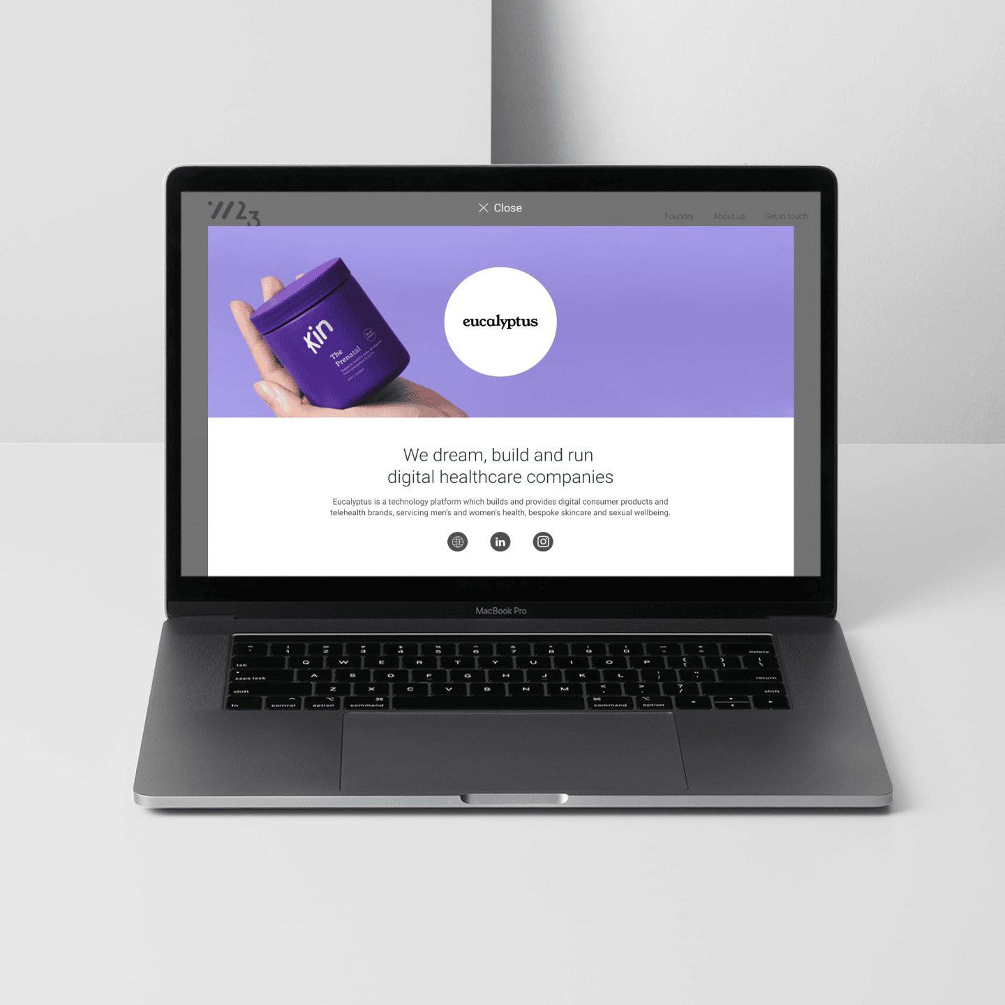
Backing the businesses transforming retail
W23 is a global grocery retail innovation fund, backed by Woolworths, that invests in the startups, scaleups and small businesses that are transforming retail. We were tasked with rebranding W23; the goal was a more modern, simple and clean outcome, but not corporate. The brand needed to be approachable, with a simple design system that sat naturally within the Woolworths Group ecosystem, while still maintaining its own unique expression.


A deeper understanding
We ran a brand expression workshop to dive deeper into the brief and better understand where we wanted to take the W23 brand, this also included an element of strategy, ensuring the new brand had a clear connection to the vision of the business and the people it invests in.
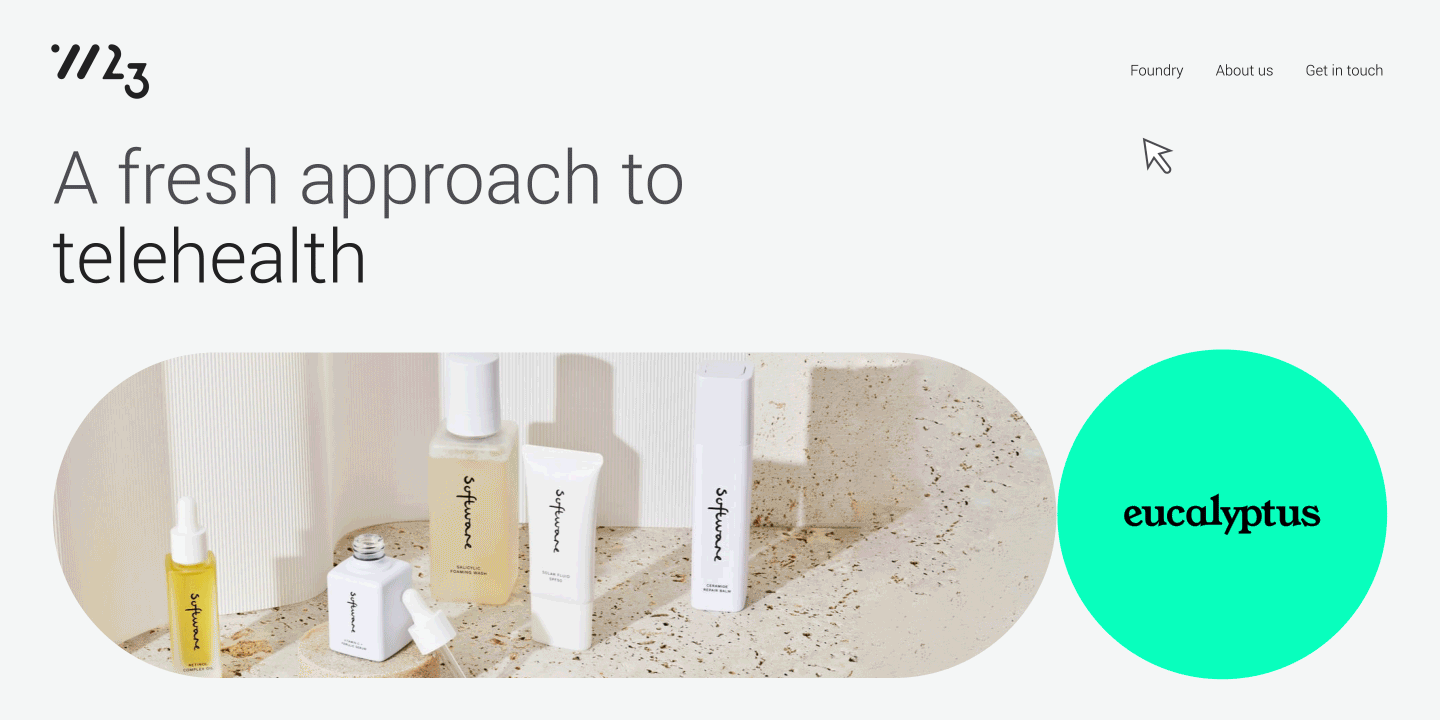
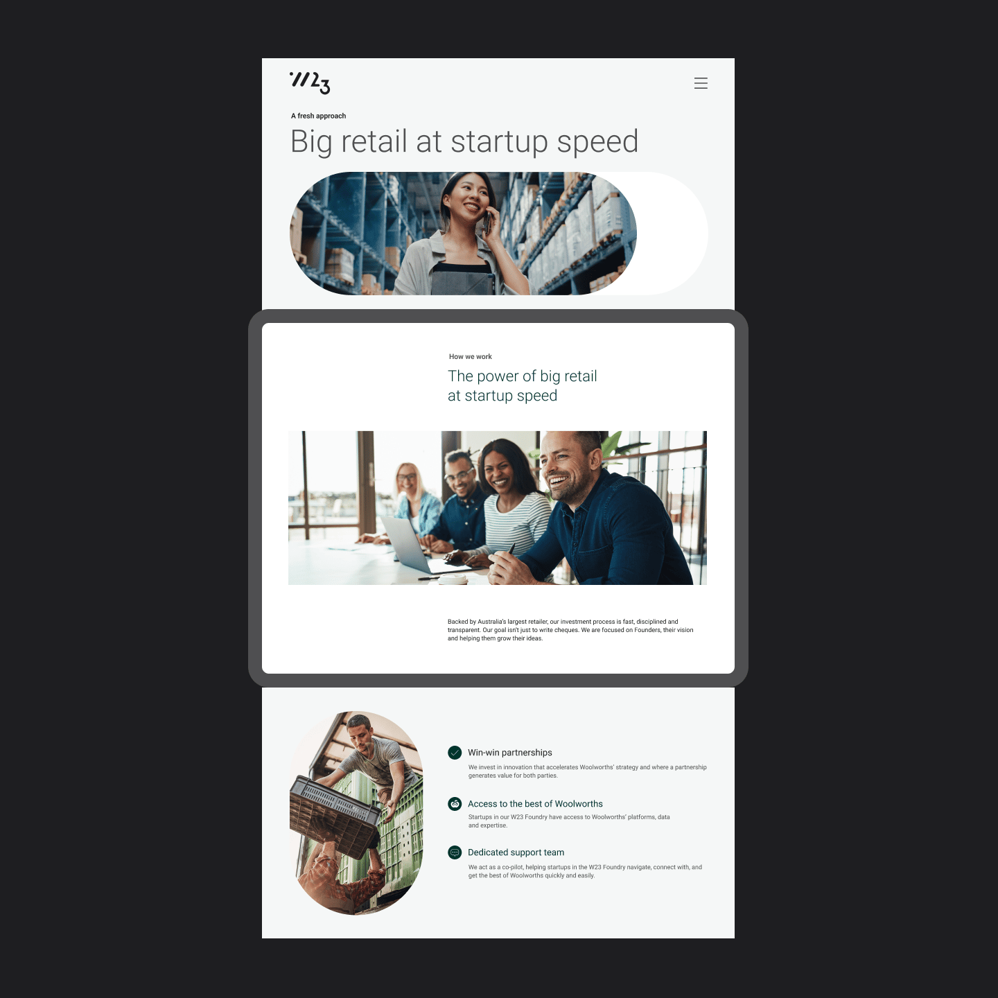
On the back of our learnings from the workshop, we set to creating a new logo and visual identity for W23, rolling it out across a new website, pitch presentation decks, newsletters and animation.


The visual system
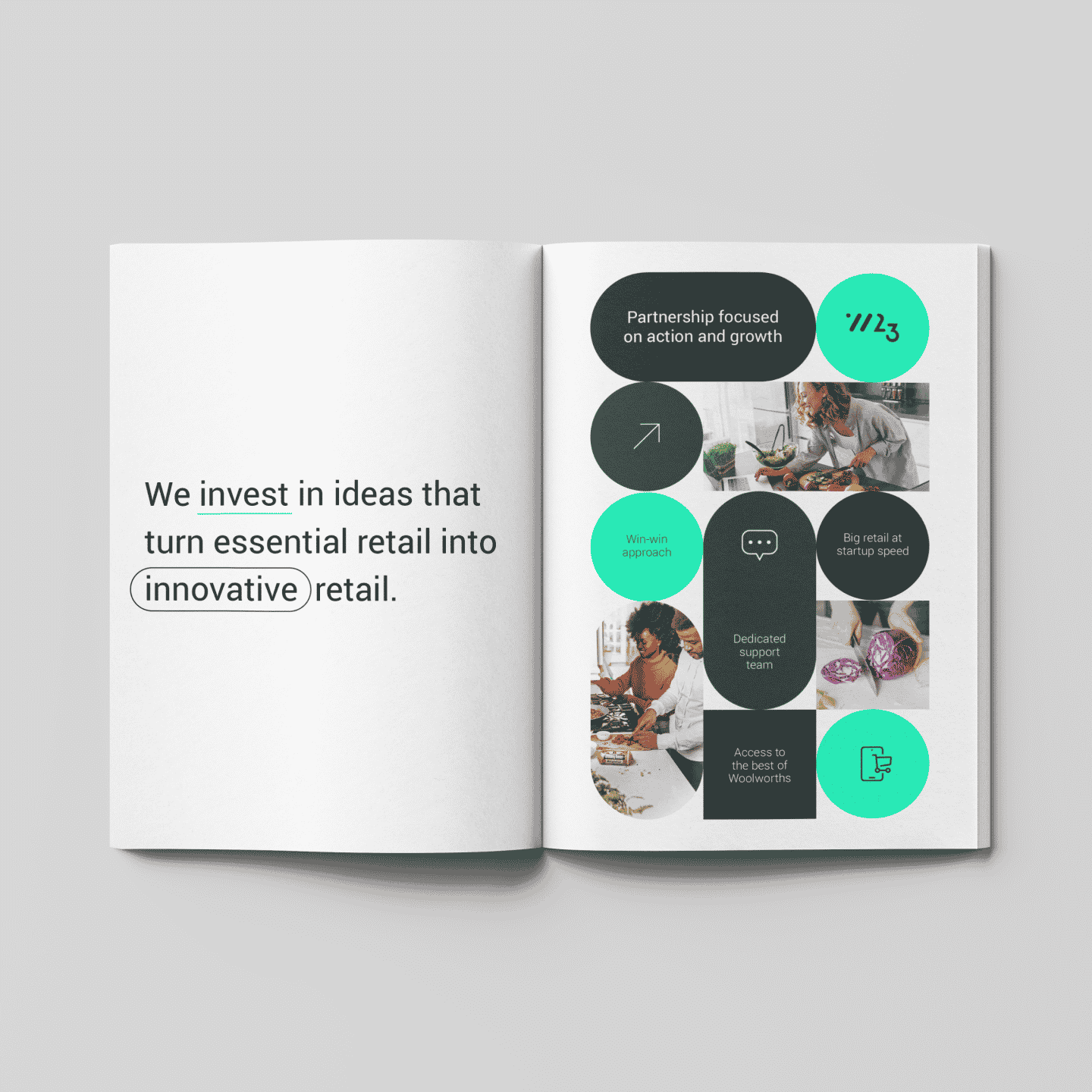
The new W23 brand identity is based on two concepts. First is the trinity of parties involved; retailers, entrepreneurs and investment experts — representing that W23 is more than just a one-way street, it’s an exchange of investment, knowledge and technology.
This leads into the second concept — acceleration — speaking to the effect of W23, supporting innovation, scale and transformation.

Creating a sense of progression
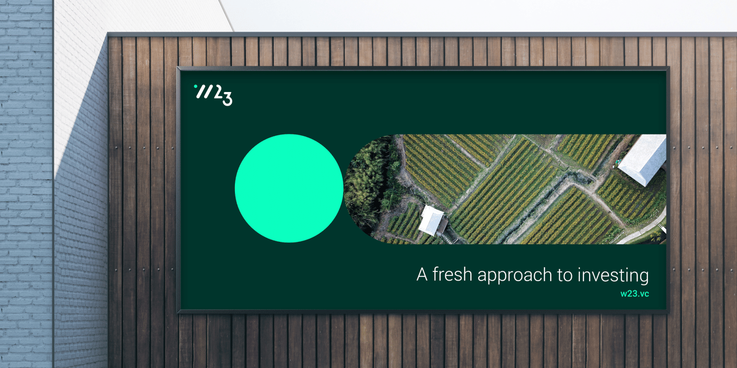
The new W23 brand identity delivers a sense of progression, founded on the interactions between the parties involved. This manifests itself visually in the circles and pills of the brand seen on the updated website and supporting collateral, that can be expressed digitally, in print and in motion.
Like what you see?
- Production
- Branding
- Animation
- UX/UI
- Design
Lorem ipsum
dolor sit amet
Lorem ipsum dolor sit amet, consectetur adipisicing elit. Qui aperiam dignissimos omnis. Ipsa quo similique aut consectetur voluptate odit, voluptatem, facilis! Tempora omnis ad nesciunt laborum ut numquam porro ratione!
Lorem ipsum dolor sit amet, consectetur adipisicing elit. Rem, laborum repellat nesciunt magnam numquam. Ex consequatur voluptas quidem nam recusandae ab ullam, incidunt ea voluptatum delectus voluptatem, quisquam quas, quae.
Lorem ipsum dolor sit amet, consectetur adipisicing elit. Reprehenderit dolore molestiae corrupti ullam molestias quas nostrum id nobis architecto obcaecati magni debitis nulla accusantium perferendis, necessitatibus at! Animi, alias, consectetur?

Qui aperiam dignissimos omnis


Lorem ipsum dolor sit amet, consectetur adipisicing elit
Lorem ipsum dolor sit amet, consectetur adipisicing elit. Rem, laborum repellat nesciunt magnam numquam. Ex consequatur voluptas quidem nam recusandae ab ullam, incidunt ea voluptatum delectus voluptatem, quisquam quas, quae.
Lorem ipsum dolor sit amet, consectetur adipisicing elit. Reprehenderit dolore molestiae corrupti ullam molestias quas nostrum id nobis architecto obcaecati magni debitis nulla accusantium perferendis, necessitatibus at! Animi, alias, consectetur?

Tempora omnis ad nesciunt