Straight to the pool room
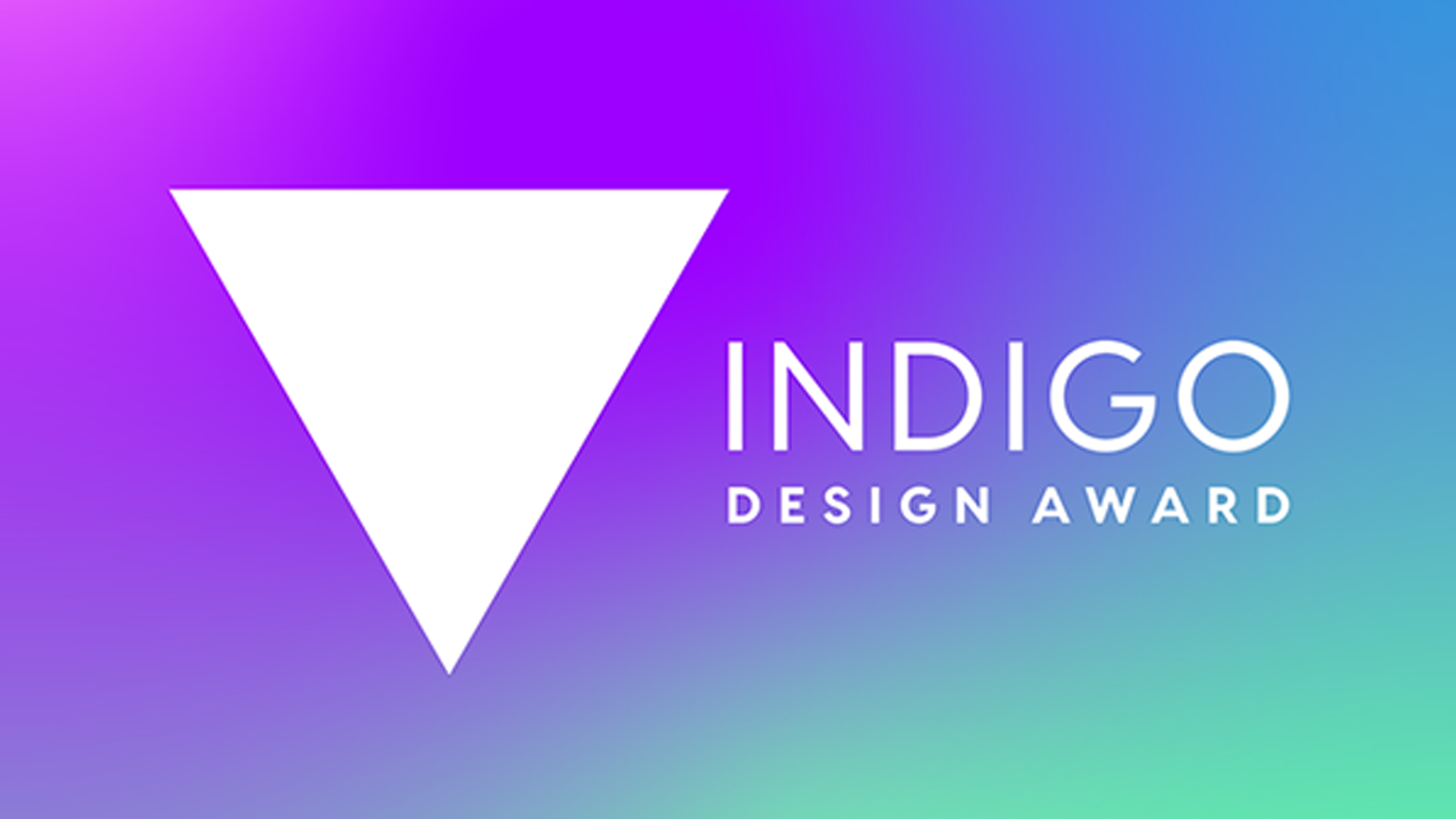
If you’ve been hearing whoops, cheers and rounds of applause from our studio (sorry neighbours) it’s because we’ve been celebrating. We’ve recently been awarded with not one but four gold Indigo Design Awards 😲 Uh, and we’ve been shortlisted for the 2021 Branding Design of the Year Award.
The Indigo Design Awards celebrates international design projects that break new ground in composition and layout. In keeping with the complexity of creating an indigo dye, they award work which shines with an uncommon artistry.
Our awards include:
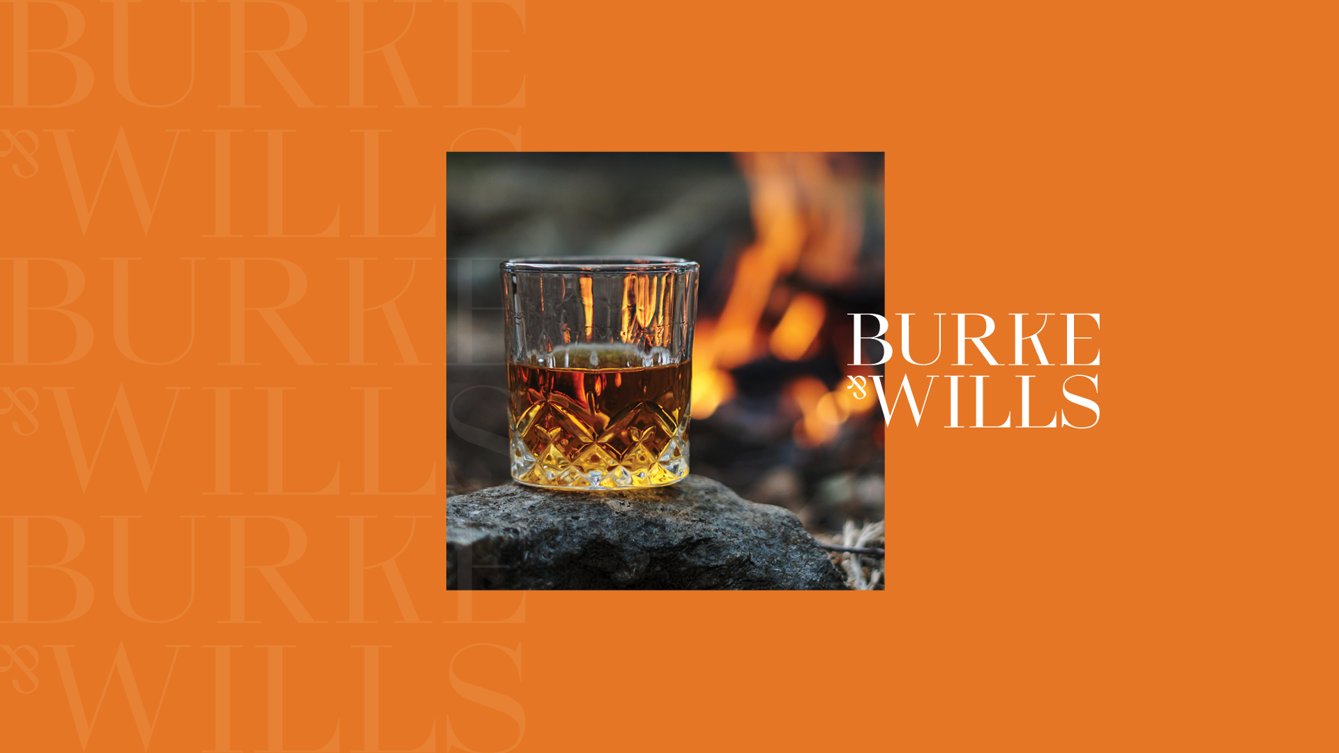
Gold for logo design: Burke & Wills whisky
We Australians admire struggle more than victory (just look at the ANZACs, Ned Kelly, Steven Bradbury, etc). So although Burke & Wills didn’t become famous for reaching their destination, they did become famous for their wild adventure.
The logo for Burke & Wills whisky uses an uppercase typeface to speak to the audacity of their adventure, while its elegant design is inspired by the quality of the whisky. The upside down ampersand subtly highlights the imperfections, and ultimate failure, of the expedition to give the brand an easy-going personality.
The colour palette and imagery reflect the natural surroundings of the historic journey to north Australia. Bold and vibrant tones modernise the brand and help bring to life the two lives lost and reincarnated around a fine whisky — Burke & Wills.
Lead Designer: Becky Gillis
Creative team: Design Director Sophie Taylor, Copywriter Celina Siriyos
Client services: Rosie Dingle
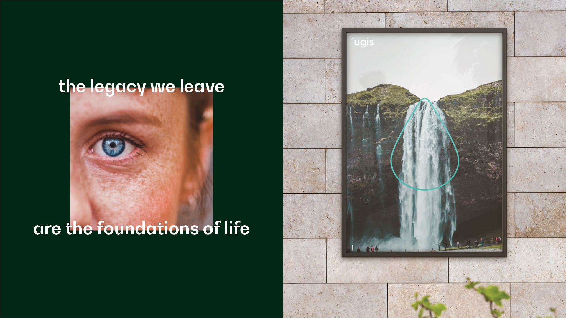
Gold for branding: iugis
iugis [yoo-gis] deliver solutions that reduce environmental impact while offering commercial benefits to a business. With a focus on a sustainable future covering food waste, energy efficiency and water solutions, iugis wanted a brand that could speak to the lasting legacy of the actions we take today.
The logo is a play on illusory contours, spacing and visual hierarchy. As it’s not obvious how to pronounce it, the removal of the i’s stem guided people to start with the letter ‘u’ instead.
To illustrate the three core offerings we have simple shapes; a circle for food waste, a triangle for energy efficiency and a droplet for water solutions. Photography is primarily nature-based, often paired with similar colours from the brand palette.
Lead Designers: Becky Gillis and Natalie Wong
Creative team: Creative Director Tristan Velasco, Design Director Sophie Taylor, Copywriter Celina Siriyos
Client services: Archie De Sales
Gold for logo design, Gold for branding, and shortlisted for branding design of the year: Shef
The Shef story began at the Syrian border where a group of refugees waited to cross. Over some home-cooked meals, founders Joey and Alvin forged a new kind of family—and a sense of empowerment. Today, Shef is a US-based home delivery platform which connects home cooks to expats and immigrants searching for authentic, region-specific, home-made meals.
Inspired by the diacritical marks found in many written languages, the Shef brandmark was developed by using a simple sans-serif typeface. We imagined a bowl over ‘e’ as an upturned circumflex accent; Shef’s very own mark. The colour palette is drawn from the range of cultures featured through the platform and our vibrant imagery focusses on our ‘shefs’. And becase both shefs and patrons are linguistically diverse groups we developed a voice that is natural, clear and warm.
Here, food isn’t just access to energy, but a way for people to stay connected to their culture, experience other cultures or be part of a wider community. Each dish created tells a story, not only of a culture, but of the shefs themselves.
Lead Designer: Natalie Wong
Creative team: Copywriting Celina Siriyos, Illustration William Nghiem, Creative Director Tristan Velasco, Design Director Sophie Taylor
Client services: Archie De Sales, Rosie Dingle
We’re very proud to work with companies doing such a range of interesting, ambitious things. From supporting Australian distilleries to creating an income stream for people who find themselves in a new country, these brands have rich and meaningful stories to tell. We know it takes some faith to handover the creative direction of a company. So thanks for trusting us.
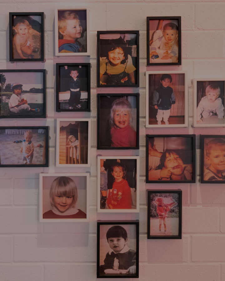
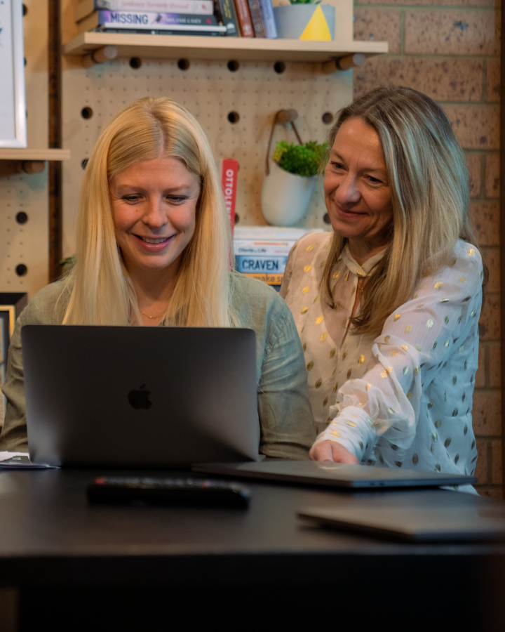
And thanks to our whole team for making this possible too. Those of us who didn’t have a direct hand in these projects make the studio the kind of place that can create award-winning work.
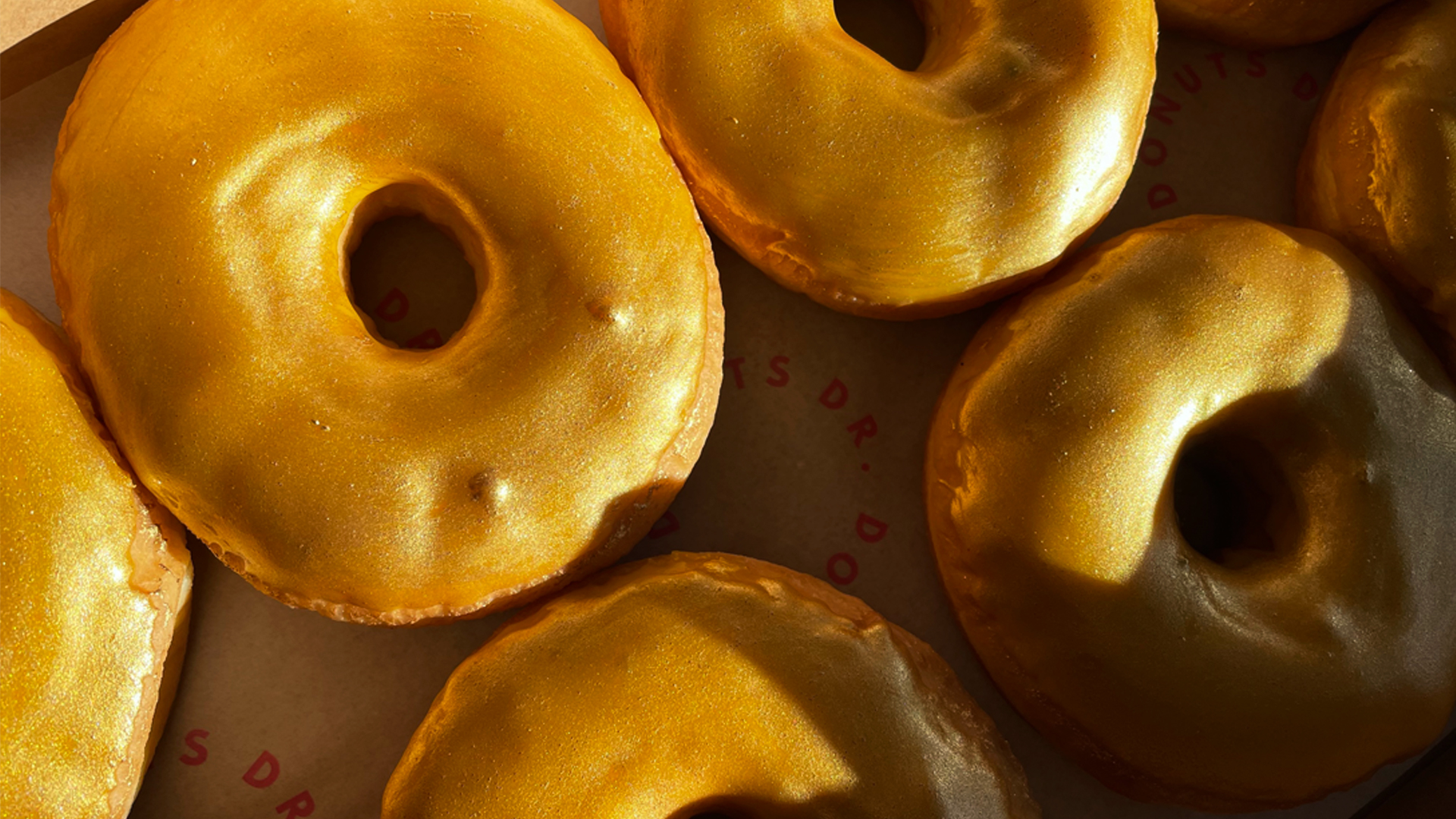
The 2021 branding design award will be announced in a few weeks, but for now we’re excited to share this accomplishment and get stuck into some celebratory gold donuts.
We’re thrilled Campaign Brief picked up the good news too, you can have a read here.