- Copywriting
- Strategy
- Branding
- Campaign
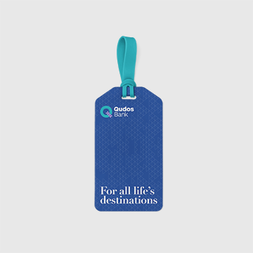
For all life’s destinations
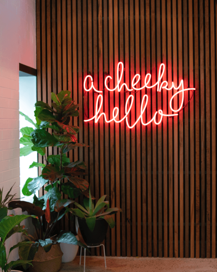
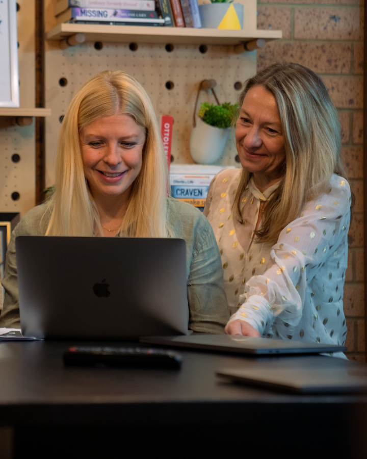
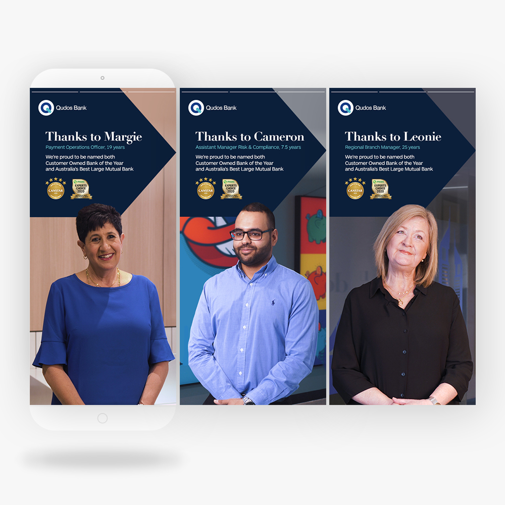
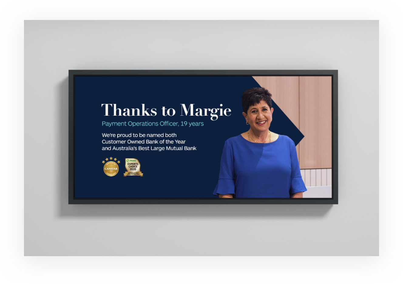
We’ve worked with Qudos Bank as their lead creative agency for some time, rolling out campaigns and communications. At the same time, we were helping to refine their brand, story and voice; working on the roots of their brand. We knew that they had great pride in their heritage and cared deeply about their customers — who also happen to be their owners. They’re a customer-owned bank and they’ve never forgotten it.
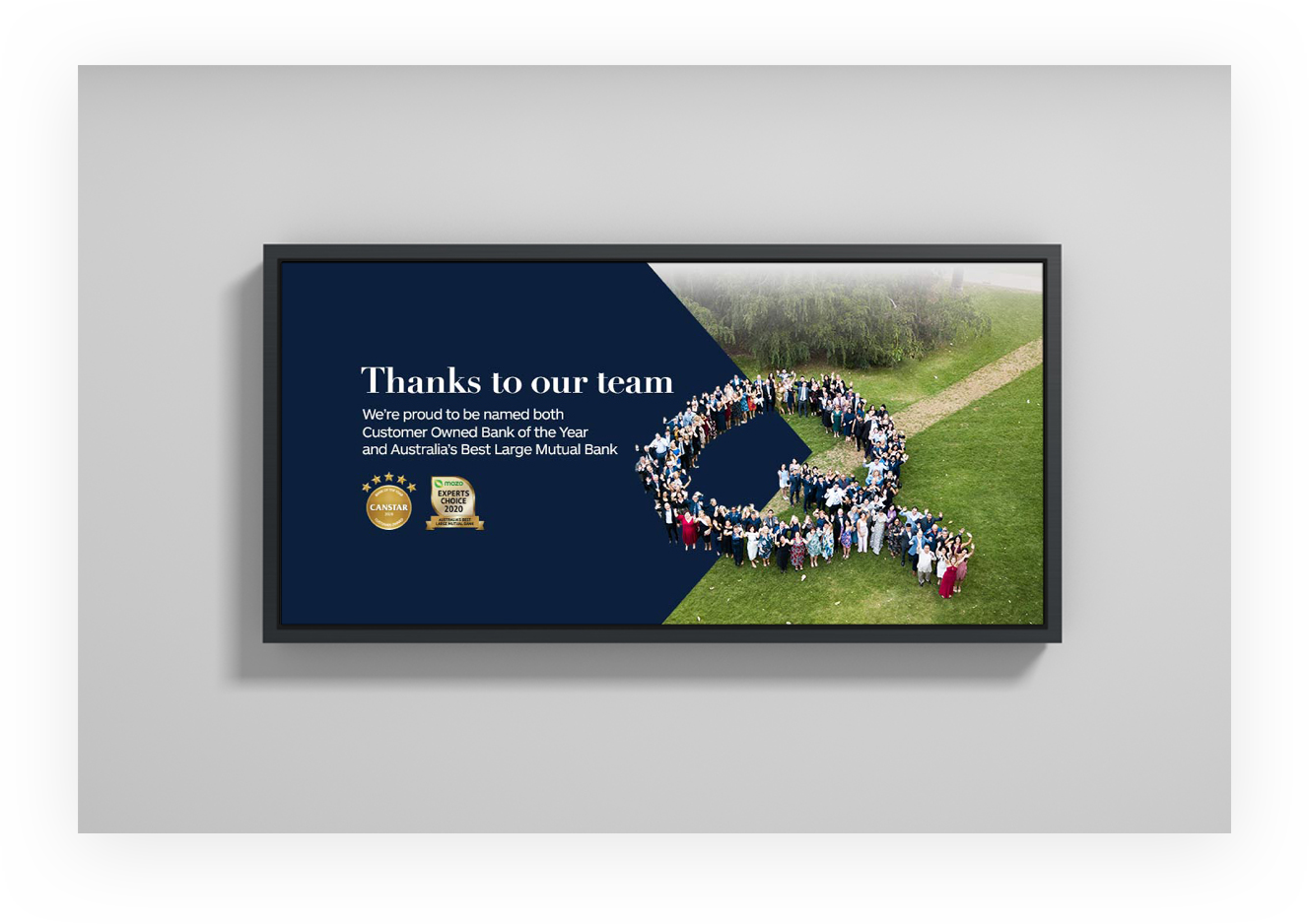
As proof of how much they care, they recently earned Canstar’s Customer-Owned Bank of the Year and MOZO’s Australia’s Best Large Mutual Bank for 2020. They’re awards that they (and we) are very proud of.

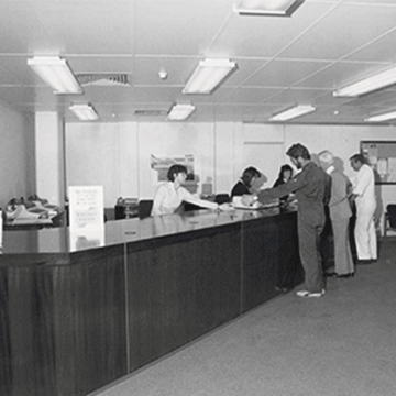
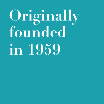
Where Qudos began
You might recognise the name Qudos from their arena in Sydney Olympic Park but its history goes way back. Originally founded in 1959 by fourteen Qantas employees, it was long known as Qantas Credit Union and its members were staff and family members. In 2016, it changed its name to Qudos Bank after its membership had grown far beyond Qantas employees and Qantas wanted to reclaim the use of their name. Their brand was bright, bold, zany and youthful.
With this change Qudos found new and younger customers, but the loyalty of their original customers had always remained. This left them with a dilemma: which direction to go?

Reflecting to go forward
Bank brands have many stakeholders and it’s a delicate process creating change. We were careful to workshop the Qudos team’s concerns, find successes and really listen. When we talked about where their brand was going, we found that heritage was still hugely important to them. We needed to introduce it in a way that looked to the future, but never forgot the past. They had a strong sense of what made Qudos ‘Qudos’ but it was getting lost in their bold branding.
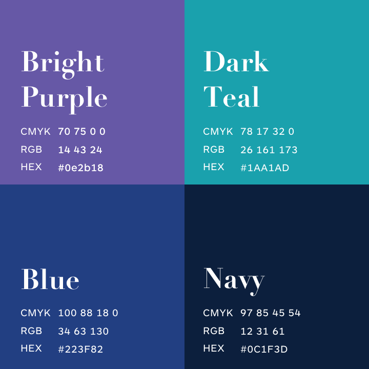
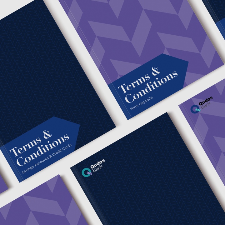
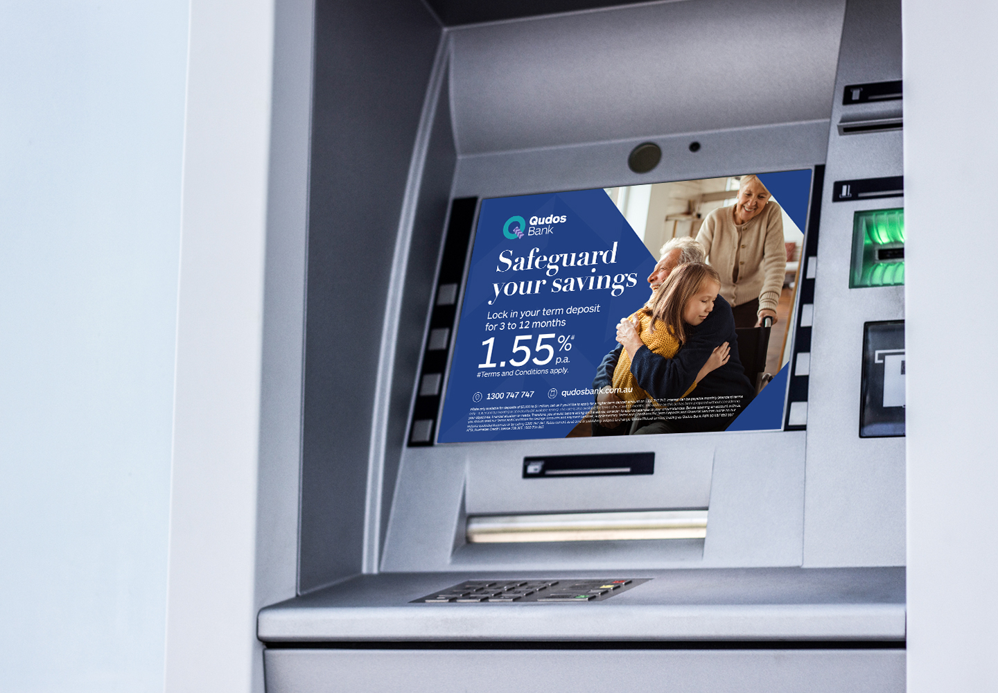
Less colour, more confidence
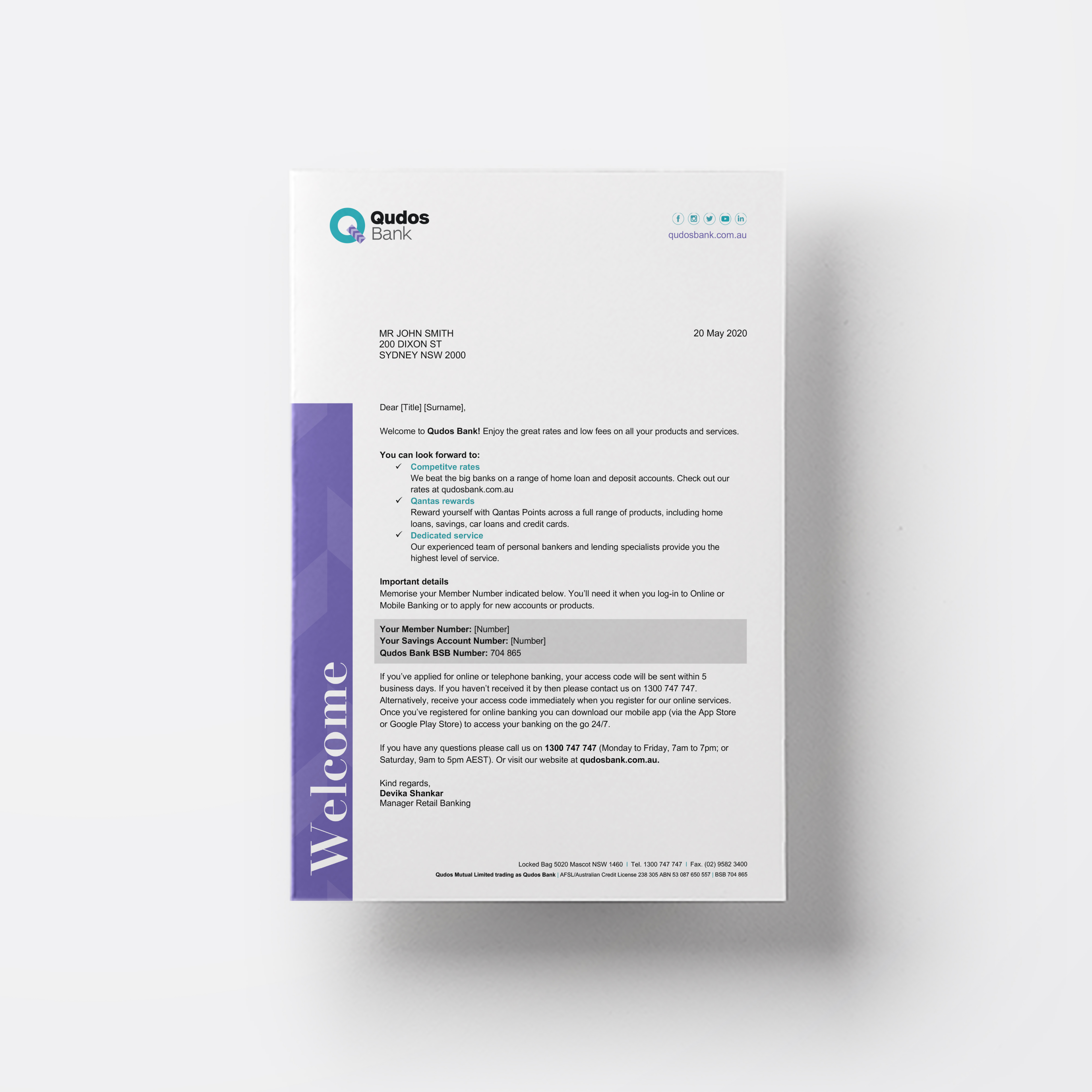
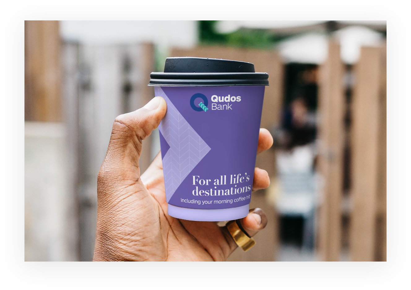
We saw that Qudos were using many colours and combinations in their visual identity. The obvious step was to pare it back. By being more consistent they could be more recognisable. It’s always hard to let go of more visual options, but with a smaller palette there was more space to be creative and feel more confident. Or as one of their team said: “It makes us look more ‘us’.”.
The right words to tell a story
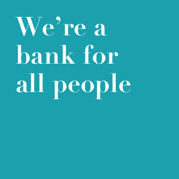
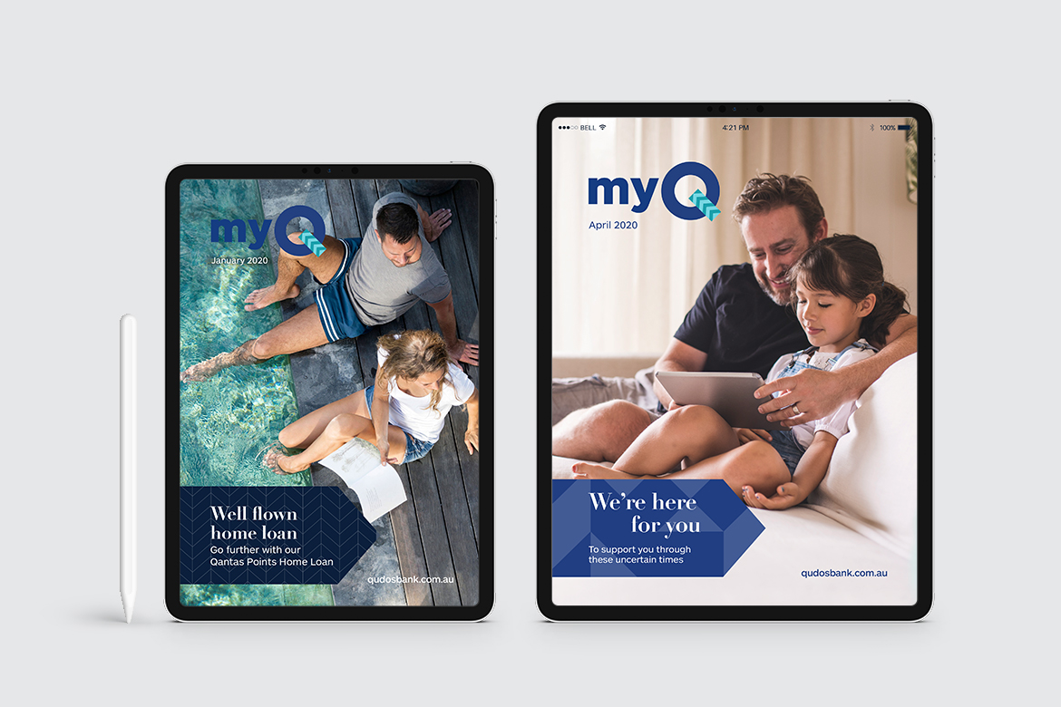
Qudos wanted to remain connected to travel and add in an element of ‘lifestyle’, of freedom, in their brand. After all their products are still connected to the Qantas Frequent Flyer program and it was a way of appealing to future customers. We worked on a tone of voice that followed the colour scheme; a little more composed but always assured. We also re-wrote their story to distill the past and point to the next chapter. With the tagline “For all life’s destinations” they could reach into new spaces while alluding to their beginnings.
Like what you see?
- Copywriting
- Strategy
- Branding
- Campaign
Lorem ipsum
dolor sit amet
Lorem ipsum dolor sit amet, consectetur adipisicing elit. Qui aperiam dignissimos omnis. Ipsa quo similique aut consectetur voluptate odit, voluptatem, facilis! Tempora omnis ad nesciunt laborum ut numquam porro ratione!
Lorem ipsum dolor sit amet, consectetur adipisicing elit. Rem, laborum repellat nesciunt magnam numquam. Ex consequatur voluptas quidem nam recusandae ab ullam, incidunt ea voluptatum delectus voluptatem, quisquam quas, quae.
Lorem ipsum dolor sit amet, consectetur adipisicing elit. Reprehenderit dolore molestiae corrupti ullam molestias quas nostrum id nobis architecto obcaecati magni debitis nulla accusantium perferendis, necessitatibus at! Animi, alias, consectetur?

Qui aperiam dignissimos omnis


Lorem ipsum dolor sit amet, consectetur adipisicing elit
Lorem ipsum dolor sit amet, consectetur adipisicing elit. Rem, laborum repellat nesciunt magnam numquam. Ex consequatur voluptas quidem nam recusandae ab ullam, incidunt ea voluptatum delectus voluptatem, quisquam quas, quae.
Lorem ipsum dolor sit amet, consectetur adipisicing elit. Reprehenderit dolore molestiae corrupti ullam molestias quas nostrum id nobis architecto obcaecati magni debitis nulla accusantium perferendis, necessitatibus at! Animi, alias, consectetur?

Tempora omnis ad nesciunt